When it comes to designing business cards, every detail matters. From the color scheme to the choice of font, each element contributes to the overall impression you make on potential clients and business partners. One crucial aspect that often gets overlooked is the type size used for the text on your business card. The right type size can enhance readability and professionalism, while the wrong choice can lead to a cluttered and unprofessional look. In this article, we will explore the importance of type size for business cards and guide you in finding the perfect balance.
Why Type Size Matters
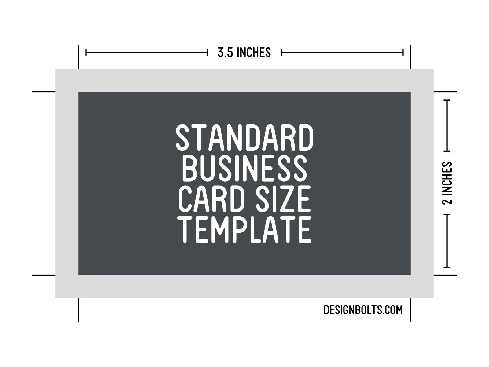
The primary function of a business card is to convey essential information about you and your business. This includes your name, job title, company name, contact details, and possibly your logo. To effectively communicate this information, it is crucial that the text on your business card is legible and easy to read.
Consider the purpose of your business card. It acts as a first impression, representing your brand and professionalism. If someone has to strain their eyes to read the text on your card, it reflects poorly on you and your business. On the other hand, if the type size is too large, your card may seem unprofessional and lacking in design aesthetics.
Striking the Right Balance
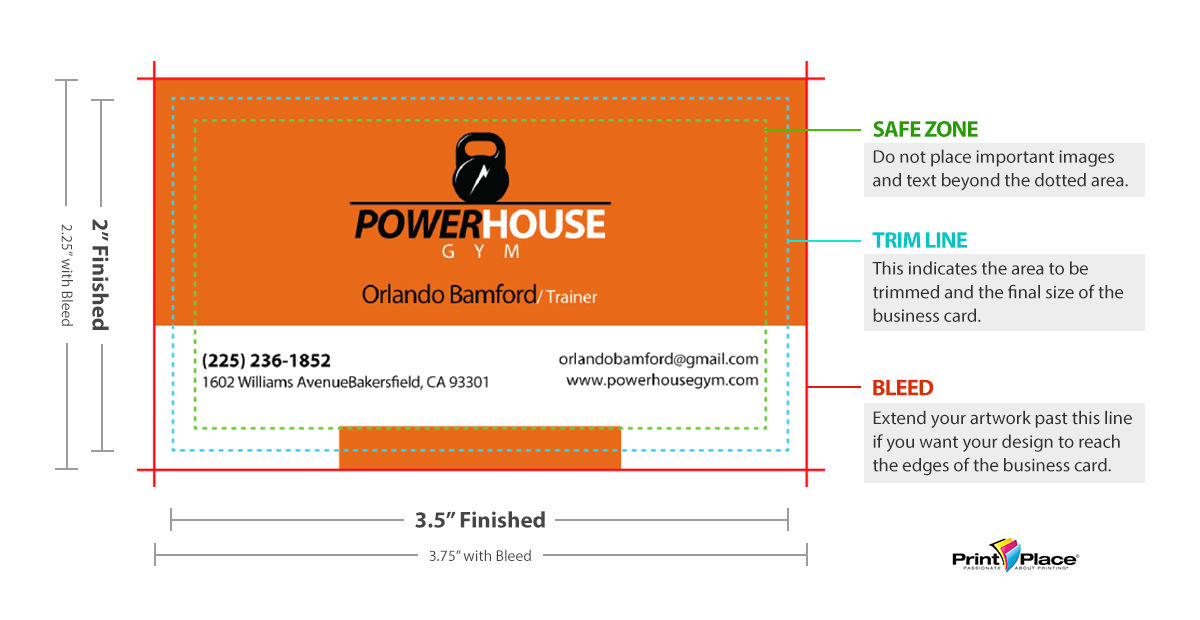
Finding the right type size for your business card involves striking a balance between readability and aesthetic appeal. You want to ensure that the text is easily legible without overwhelming the overall design. Here are some considerations to keep in mind:
1. The Typeface You Choose
Different typefaces have inherent characteristics that affect how they appear at different sizes. Some typefaces are naturally more legible at smaller sizes, while others are better suited for larger text. It is essential to select a typeface that maintains its clarity and readability when scaled down to business card size.
2. The Amount of Information
The more information you include on your business card, the smaller the type size will need to be. Consider what information is essential and eliminate any unnecessary details. By prioritizing the most critical information, you can increase the type size for those elements, while still maintaining readability.
3. Hierarchy and Emphasis
Not all text on your business card needs to be the same size. By utilizing visual hierarchy and emphasizing key details, you can guide the reader’s attention to the most important information. Your name and job title, for example, might warrant a larger type size than your contact details, allowing them to stand out.
4. Test Print
Before finalizing the type size, it is crucial to print a test version of your business card. Viewing it on a computer screen might not accurately represent how it will look when printed on a smaller scale. By physically printing a prototype, you can assess the readability and make any necessary adjustments before producing the final batch of cards.
Recommended Type Sizes
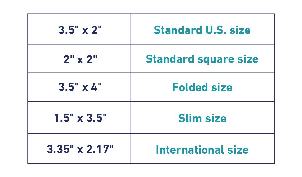
While there is no one-size-fits-all answer to the perfect type size for business cards, there are some general guidelines to consider. The following recommendations can serve as a starting point for finding the right balance:
Name and Job Title
Make your name and job title the focal point of your business card by using a slightly larger type size than the rest of the text. Recommended sizes for these elements typically range between 10 and 14 points. Experiment within this range to find what looks best with your chosen typeface.
Company Name
Your company name, although less prominent than your personal details, should still be easily readable. A suggested type size for the company name is between 8 and 12 points. Again, adjust as necessary based on the legibility of your chosen typeface.
Contact Information
The type size for your contact details, such as email address, phone number, and website, can be slightly smaller than your name and company name. A range of 6 to 10 points is usually suitable for these elements. Ensure that the type remains legible even at the smaller size.
The Impact of Design Choices
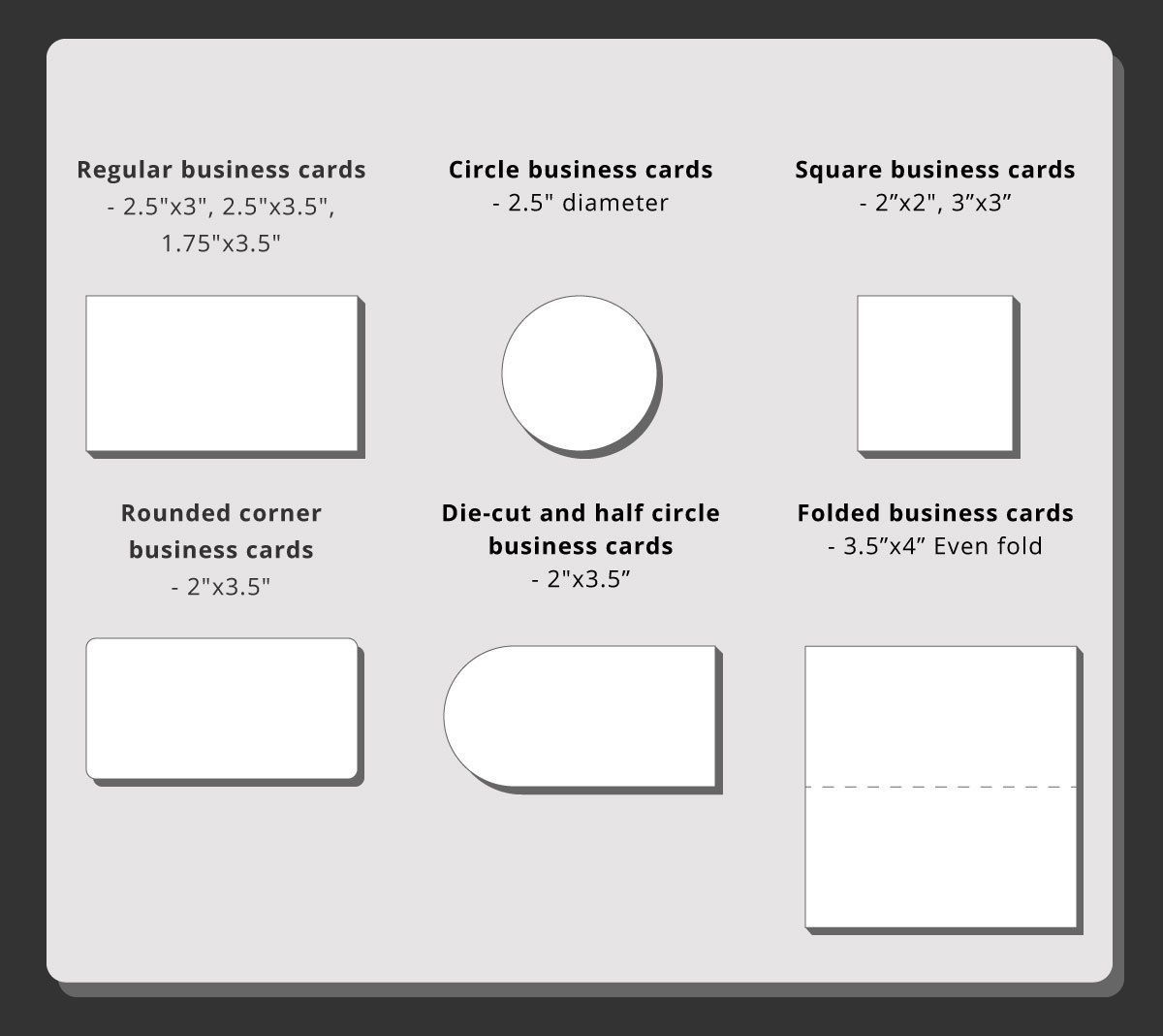
In addition to the type size, other design choices can also affect the readability and overall effectiveness of your business card. Here are a few factors to consider:
Contrast
Ensure there is sufficient contrast between the text and the background to enhance legibility. Avoid using light text on a light background or dark text on a dark background, as it may strain the reader’s eyes.
White Space
Don’t overcrowd your business card with too much text or design elements. Leaving enough white space around your text enhances readability and makes your card appear more professional and clean.
Font Weight
Consider using a slightly thicker font weight for your type to improve legibility, especially if you choose a relatively small type size. Experiment with different font weights to find the right balance between readability and aesthetics.
In Conclusion
When designing your business card, it is important to pay attention to the type size. Finding the perfect balance involves considering factors such as the typeface, amount of information, hierarchy, and emphasis. By testing print versions and following general guidelines for type sizes, you can create an effective and visually appealing business card.
Remember, a well-designed business card that prioritizes readability will make a positive impression on those who receive it. So take the time to carefully choose the type size for your business cards and ensure they embody the professionalism and attention to detail that represents your brand.
Isabella, a branding guru, merges her love for storytelling with her marketing expertise. Her fascination with cultural diversity and travel lends a global perspective to her writing about business cards and graphic design. In her free time, she explores new cuisines and documents her culinary adventures.