
When designing your business cards, one of the most crucial decisions you’ll need to make is choosing the right font. The font you choose can greatly impact the overall look and feel of your business cards, making it essential to select a font that effectively represents your brand and communicates your message clearly. In this article, we will explore the importance of choosing a good font for business cards and provide you with some useful tips to help you make the right decision.
Understanding the Significance of Font Choice
It’s easy to underestimate the importance of font choice when creating business cards. However, the font you use can significantly influence how your brand is perceived. A well-chosen font can evoke emotions and convey your company’s values, while a poorly chosen one can create confusion or give off an unprofessional vibe.
Consider the Tone and Personality of Your Brand
Before delving into specific font choices, it’s essential to consider the tone and personality of your brand. Are you a law firm aiming for a professional and authoritative look, or a creative agency looking for a more modern and artistic feel? The font you choose should align with your brand’s personality and reflect the message you want to convey.
Serif vs. Sans Serif Fonts
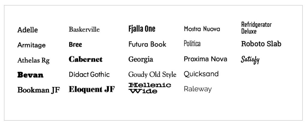
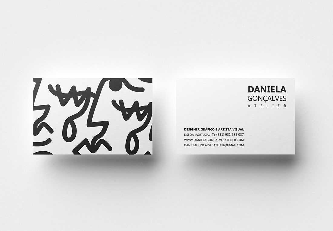
When it comes to business card fonts, two main categories dominate the landscape: serif and sans serif fonts. Serif fonts have small decorative lines or “serifs” at the end of each stroke, while sans serif fonts lack these additional embellishments. Each category has its benefits and appropriateness depending on your brand style and message.
Serif Fonts: Elegance and Tradition
Serif fonts are known for their classic and elegant look, evoking a sense of tradition and authority. They are often seen as ideal choices for professional service-oriented businesses such as law firms, financial institutions, or luxury brands. Serif fonts, such as Times New Roman, Garamond, or Baskerville, exude a timeless appeal that can convey reliability and establish trust with your potential clients.
Sans Serif Fonts: Modern and Clean
On the other hand, sans serif fonts are recognized for their modern and clean aesthetic. They offer a more contemporary and straightforward feel, making them a popular choice for creative industries, startups, or businesses that want to convey a sense of innovation. Popular sans serif fonts include Helvetica, Arial, and Futura, which can give your business cards a fresh and modern look.
Legibility and Readability are Key
While it’s important to choose a font that aligns with your brand’s personality, never underestimate the importance of legibility and readability. Your business card should be easy to read at a glance, allowing recipients to quickly absorb your essential contact information without strain or confusion.
Hierarchy and Contrast
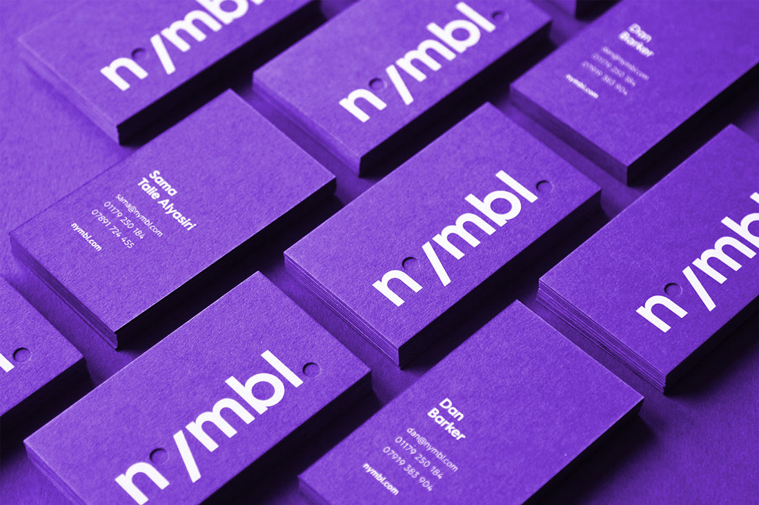
To ensure your business card is easily scannable, consider creating visual hierarchy and contrast by using different font sizes, weights, or styles. For instance, you can use a larger, bolder font for your name and a smaller, lighter font for your contact details. This approach not only enhances readability but also creates a visually appealing layout that draws attention to the most critical information.
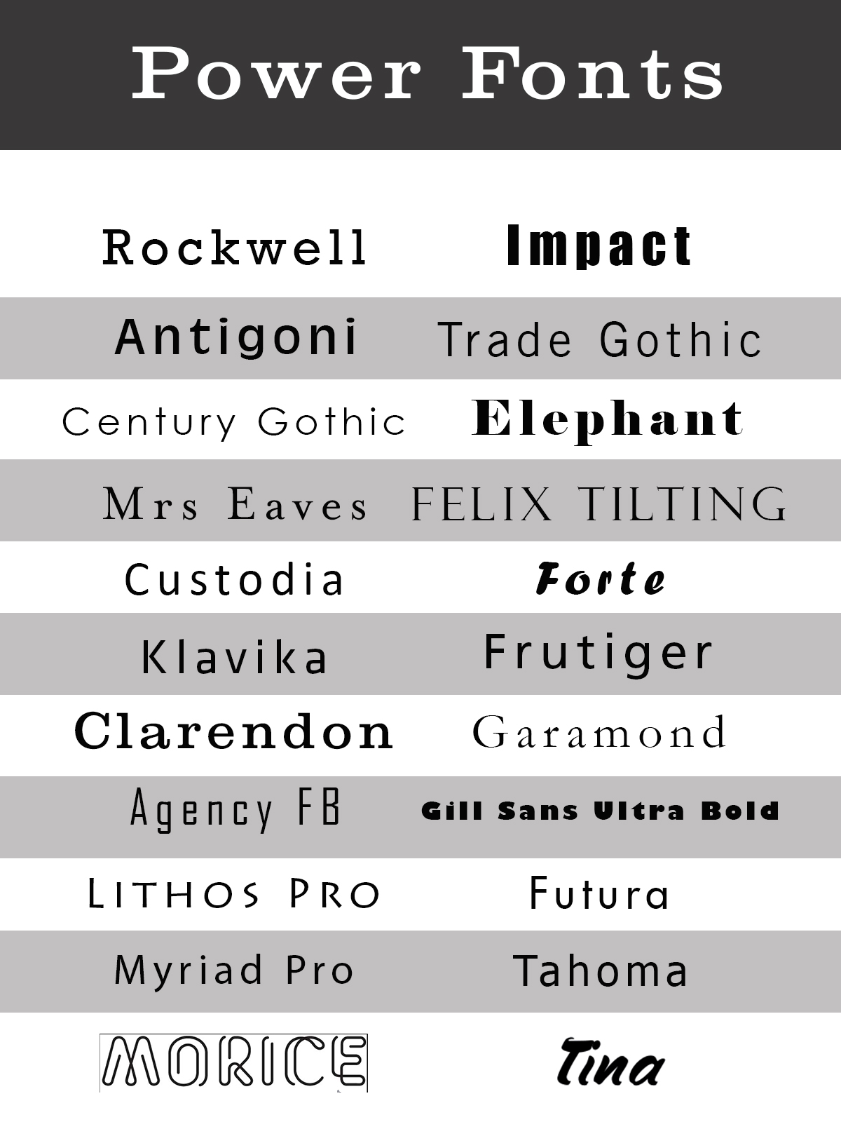
Stay Away from Script and Decorative Fonts
While script and decorative fonts can be eye-catching, they are often challenging to read, especially when used in smaller sizes. Save these font styles for special elements like a logo or a tagline, but avoid using them for crucial contact details. Instead, opt for simpler fonts that emphasize clarity and professionalism.
Contrasting Fonts for Visual Interest

To add visual interest to your business cards, you can also consider combining contrasting fonts. By pairing a serif font with a sans serif font or even mixing different serif or sans serif options, you can create a dynamic and visually engaging design that stands out.
Pairing Serif with Sans Serif
One popular approach is to pair a serif font for your brand name or logo with a complementary sans serif font for your contact details. This combination can strike a balance between the traditional warmth of serif fonts and the modern sensibility of sans serif fonts, ensuring your business cards feel both professional and contemporary.
Mixing Multiple Serif or Sans Serif Fonts
Alternatively, if you decide to use fonts from the same category, mixing multiple serif or sans serif fonts can create an interesting visual contrast. However, exercise caution to maintain consistency and coherenceâ_x0080__x0094_select fonts that share similar characteristics to avoid a jumbled or messy appearance.
Strike a Balance with Font Sizes and Colors
When choosing fonts for your business cards, it’s important to strike a balance between font size and color. Carefully consider the size of your card and the available space, ensuring that your chosen font will be legible even at smaller sizes.
Font Sizes: Larger for Impact, Smaller for Details
Use larger font sizes for your name or company name to create impact and draw attention. For contact details and additional information, opt for smaller font sizes to ensure all crucial information fits within the limited space without sacrificing readability.
Color Contrasts for Clarity
Color contrast between your font and the background is also vital for readability. Avoid light-colored fonts on light backgrounds or dark fonts on dark backgrounds, as these combinations can strain the reader’s eyes. Instead, aim for high contrast to maximize legibility and ensure your information stands out clearly.
Test and Evaluate Your Font Choices

Before you finalize your business card design with a chosen font, it’s crucial to test and evaluate how it appears on paper. What looks great on your screen may not translate well when printed. Print a sample of your business card and evaluate its readability, sizing, and overall visual appeal. Make any necessary adjustments to ensure your font choice translates well into the physical format.
Conclusion
Choosing a good font for your business cards is an essential decision that should not be taken lightly. The right font can effectively communicate your brand’s personality, establish trust, and create a lasting impression. Remember to consider the tone and personality of your brand, prioritize legibility and readability, and strike a balance between contrasting fonts, sizes, and colors. By carefully selecting a font that aligns with your business objectives, you can create business cards that not only look visually appealing but also effectively represent your brand to potential clients. So take the time to choose wisely and leave a great impression with the font you select for your business cards.
Sophia is a branding expert who intertwines style and substance in her writing. Her marketing background and love for fashion contribute to her unique take on business card design. When not writing, Sophia explores her creative side through painting and DIY projects.