In today’s digital age, where information is exchanged at lightning speed, business cards still hold a significant place in the world of professional networking. A well-designed business card can leave a lasting impression on potential clients or business partners. While many elements contribute to a visually appealing business card, one crucial aspect that often gets overlooked is the choice of font. The font you use on your business card can have a significant impact on how it is perceived and whether it effectively conveys the message you want to send. In this article, we will explore the importance of choosing the right font for your business cards and provide some valuable tips to help you make an informed decision.
The Role of Typography in Business Cards

Typography, the art and technique of arranging type, plays a critical role in visual communication. Different fonts evoke different emotions and can convey different messages. When it comes to business cards, the typeface you select can have a direct influence on how your card is interpreted by recipients.
Consider Your Brand Identity and Target Audience
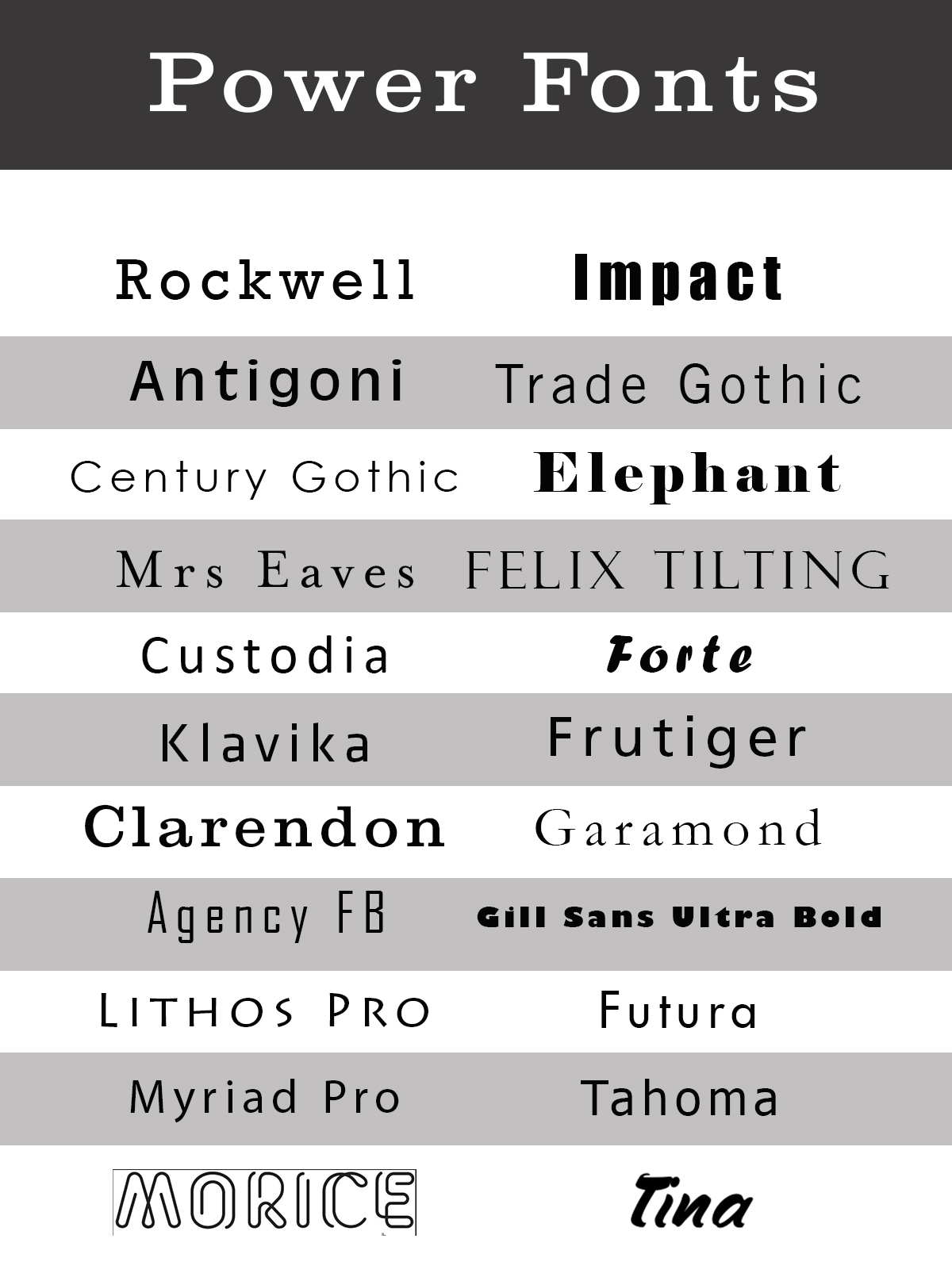
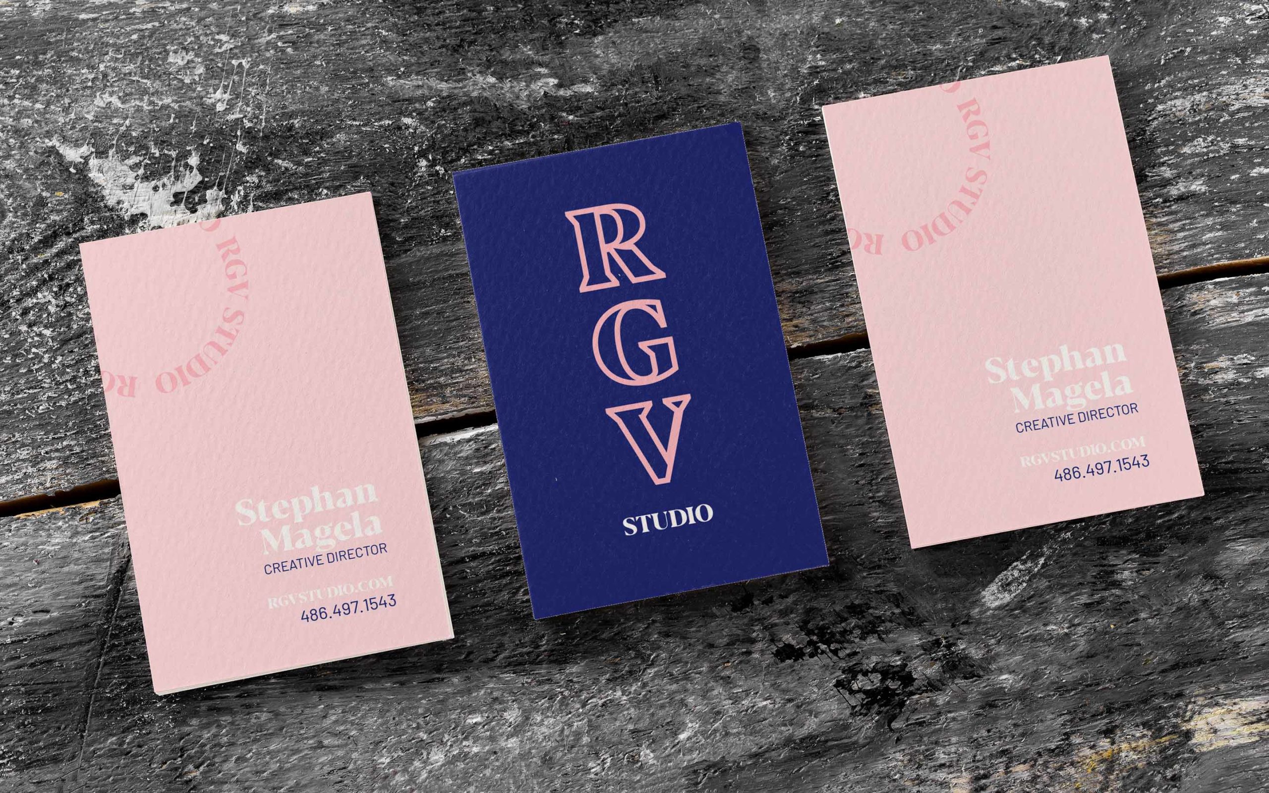
Before deliberating on individual font options, it is crucial to consider your brand identity and target audience. Your business card should align with your overall brand strategy and reflect the essence and personality of your business. For instance, if you are a law firm or an accounting agency, a traditional and formal font choice may be more appropriate. However, if you are a creative agency or a design studio, you may want to choose a font that is more artistic and visually engaging.
Additionally, keep in mind your target audience. If your business primarily caters to a younger demographic, you might want to consider using a more modern and trendy font. On the other hand, if your target market is more mature and sophisticated, a conventional font might be better suited to convey professionalism and reliability.
Serif or Sans Serif: Making the Right Choice
When it comes to selecting a font for business cards, two primary categories dominate the typography landscape: serif and sans serif. Serif fonts feature small lines or strokes (known as serifs) at the ends of characters, while sans serif fonts lack these decorative embellishments. Each category has its own characteristics that can impact the overall impression of your business card.
Serif Fonts: Classic Elegance and Tradition
Serif fonts are known for their classic and timeless appeal. Often associated with tradition and formality, they evoke a sense of reliability and professionalism. These fonts are ideal for businesses that want to establish a sense of tradition, trustworthiness, and expertise. Common serif fonts include Times New Roman, Georgia, and Garamond.
Sans Serif Fonts: Modern and Minimalist
Sans serif fonts, on the other hand, are known for their clean lines and minimalistic appearance. With a more contemporary feel, these fonts exude a sense of modernity and simplicity. Sans serif fonts are often favored by businesses that want to convey a more progressive and innovative image. Popular sans serif fonts include Arial, Helvetica, and Futura.
Readability: Ensuring Your Message Shines Through
One of the main purposes of a business card is to provide essential contact information to potential clients or partners. Therefore, it is crucial to ensure that the font you choose is highly readable. No matter how visually appealing a font may be, if it is difficult to read, it will have a negative impact on your business card’s effectiveness.
When evaluating font options, consider factors such as letter spacing, size, and legibility. Experiment with different font sizes to find the right balance between readability and aesthetics. It is also important to ensure that the font you choose maintains its clarity when printed in various sizes.
Finding the Perfect Combination: Pairing Fonts
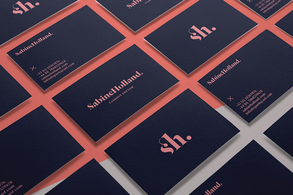
In some cases, using a single font may not provide the desired visual impact. Pairing fonts can help add depth and interest to your business card design. When choosing font combinations, it is important to consider contrast and harmony.
Contrasting fonts, such as pairing a serif font with a sans serif font, can create a visually striking composition. This combination allows for a clear distinction between different elements on your business card, making it easier for readers to identify important information.
On the other hand, harmonious font pairings, where both fonts share similar elements or characteristics, can create a cohesive and refined look. This approach is often used when a balanced and elegant aesthetic is desired.
Avoid Overly Ornate or Quirky Fonts
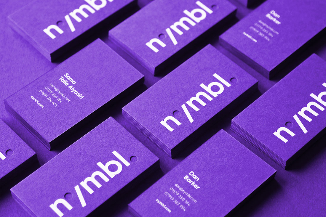
While it may be tempting to choose a font that is unique or eye-catching, it is important to exercise restraint. Overly decorative or quirky fonts can often be distracting and difficult to read, diminishing the impact of your business card.
Remember that the purpose of your business card is to convey information clearly and effectively. A font that is too elaborate or unconventional may overshadow the intended message and make it difficult for recipients to understand your contact details or company name.
Test and Iterate: Proofing Your Design
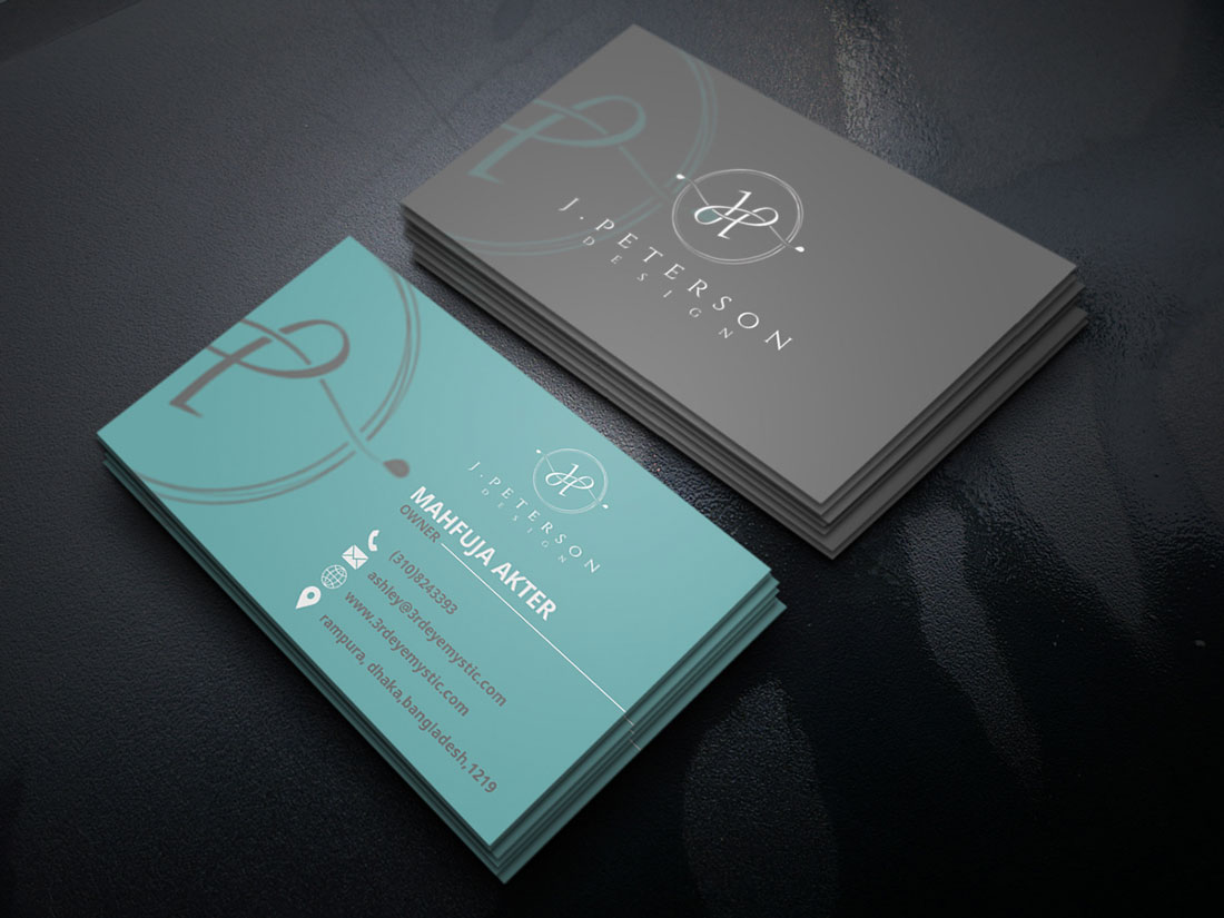
Once you have settled on a particular font or combination of fonts for your business card, it is crucial to thoroughly test your design. Print multiple copies of your business card, ensuring that the font remains clear and readable in various lighting conditions and when reproduced at different sizes.
Consider asking for feedback from colleagues, friends, or industry professionals to gauge their interpretation of your business card and whether the font effectively conveys the intended message. Make adjustments as necessary to ensure that your font choice maximizes the impact and readability of your business card.
Conclusion
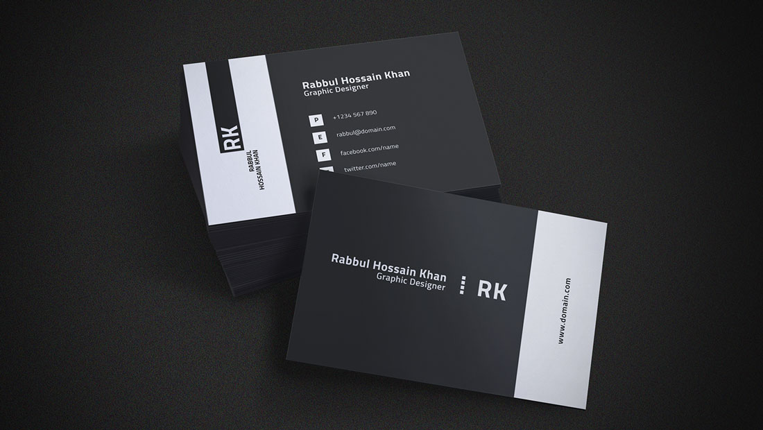
In the realm of business cards, font selection plays a vital role in creating an impactful first impression. By considering your brand identity, target audience, and the readability of different font options, you can make a carefully informed decision that aligns with your business goals. Remember to strike a balance between aesthetics and legibility while considering font combinations to add visual interest. Lastly, test and iterate on your design to ensure that your font choice leaves a lasting and positive impression on those who receive your business card. So, whether you opt for a traditional serif, a contemporary sans serif, or a carefully paired combination, choose your business card font wisely and make a statement that resonates with your audience.
Ethan is a branding enthusiast and a master of storytelling. With a background in advertising, he leverages his expertise to explore the art of graphic design and its impact on business. In his free time, Ethan enjoys photography and capturing the world’s visual intricacies.