
Are you tired of receiving business cards that leave you cringing? If you’ve ever come across a poorly designed business card, you know the feeling. Business cards are supposed to be a representation of your brand, but unfortunately, some fail to make a positive impression.
In this article, we will take a closer look at some common design mistakes that lead to the creation of the worst business cards. By understanding what to avoid, you can ensure that your own business cards showcase your professionalism and make a lasting impact on potential clients and customers.
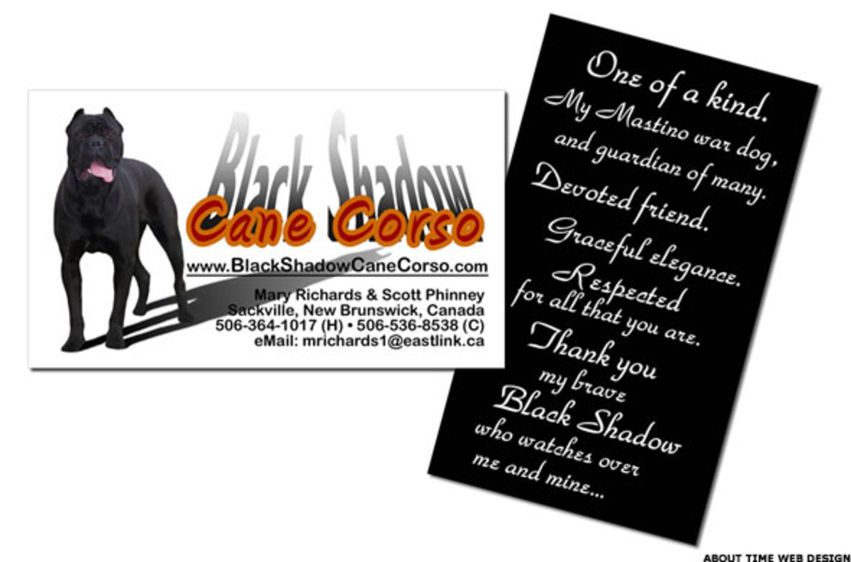
1. Overcrowded Designs

One of the primary reasons why business cards end up in the “worst” category is due to overcrowded designs. It’s tempting to include as much information as possible on a small piece of paper, but doing so often leads to a cluttered mess. Remember, your business card is not a mini billboard.
Solution: Keep your design clean and minimalist. Include only the essential information, such as your name, job title, contact details, and company logo. Avoid cramming too much text or images onto the card, as it will make it difficult for recipients to read and digest the information.
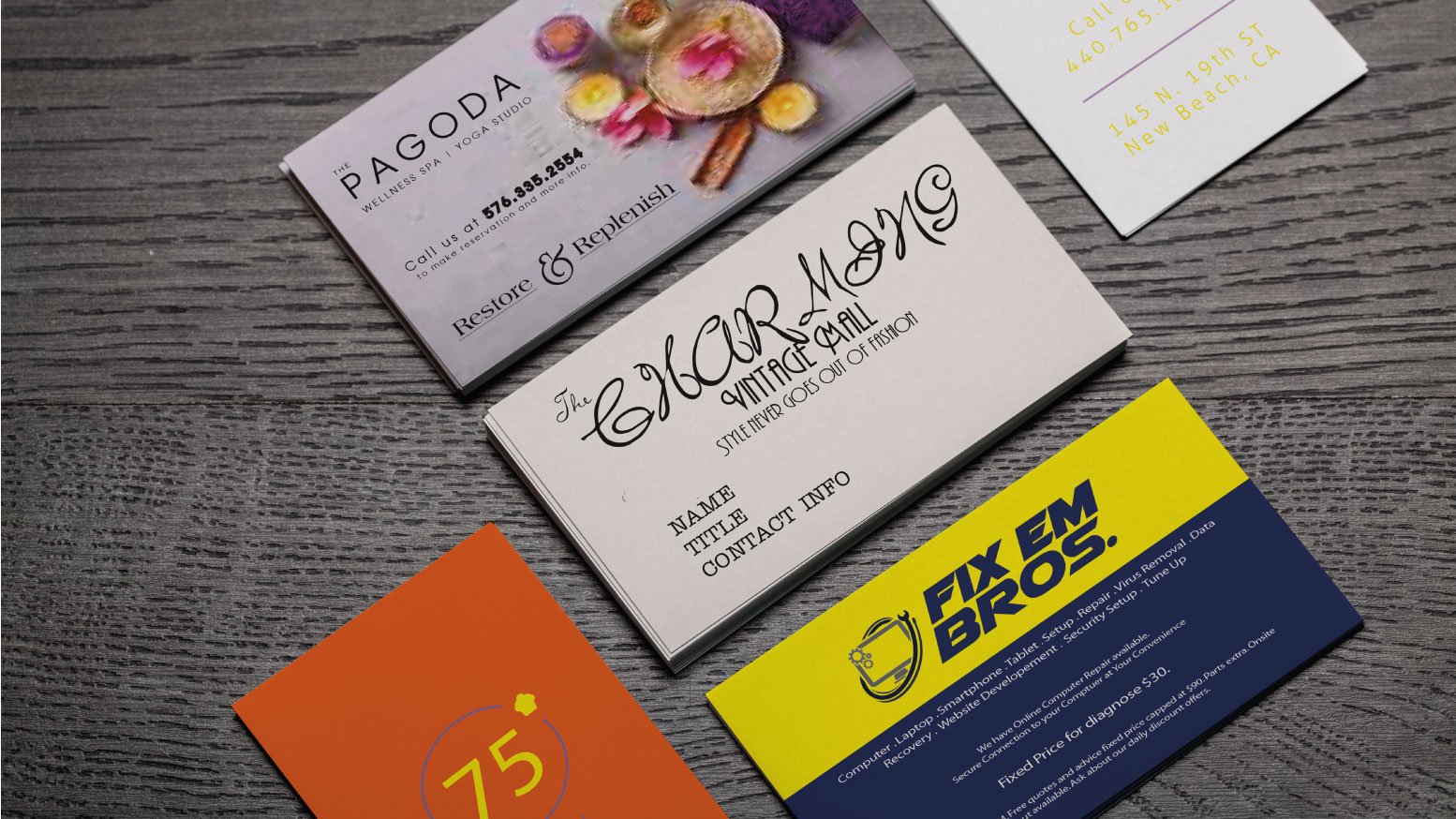
2. Poor Font Choices

The choice of fonts on a business card can make a significant impact on its readability and overall aesthetic appeal. Unfortunately, many people make the mistake of using fonts that are too decorative, illegible, or simply unprofessional.
Solution: Opt for clear, easy-to-read fonts that align with your brand’s identity. Use a combination of font styles to add hierarchy and visual interest, but be careful not to overdo it. Remember, simplicity is key.
3. Inconsistent Branding
Your business card should be consistent with your brand identity across all your marketing materials. It should reflect the same colors, fonts, and overall aesthetic as your website, logo, and other promotional materials. Inconsistencies in branding can confuse potential clients and weaken your brand image.
Solution: Choose a color palette that aligns with your brand and use it consistently throughout your business card. Ensure that your logo is prominently displayed and that the overall design reflects your brand’s image and values.
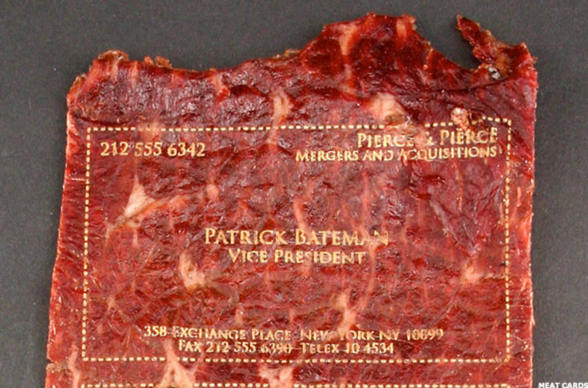
4. Low-Quality Printing
A well-designed business card can still end up in the “worst” category if it is printed on low-quality materials. Cheap printing techniques and subpar paper stocks can make your card look unprofessional and easily damaged.
Solution: Invest in high-quality printing to ensure your business card looks and feels premium. Select a paper stock that is durable and resistant to wear and tear. Consider additional finishes such as gloss or matte to add an extra touch of professionalism.
5. Lack of Contact Information
Believe it or not, some business cards fail to include necessary contact information. Imagine receiving a business card without a phone number or email address. How can someone get in touch with you? It’s a sure way to land on the list of the worst business cards.
Solution: Ensure that all essential contact details are included on your business card. This typically includes your name, job title, company name, phone number, email address, and website. If you have a physical location, consider including the address as well.
6. Uninspiring Design
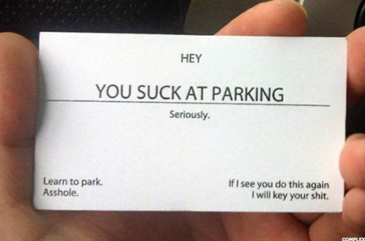
A business card should capture attention and leave a lasting impression on its recipient. However, many business cards fall flat due to uninspiring designs. When your card fails to stand out, it becomes forgettable and easily tossed aside.
Solution: Get creative with your design. Use bold colors, interesting patterns, or unique shapes that reflect your brand’s personality. Consider adding a touch of creativity to make your business card more memorable, whether it’s through a clever tagline or a captivating visual element.
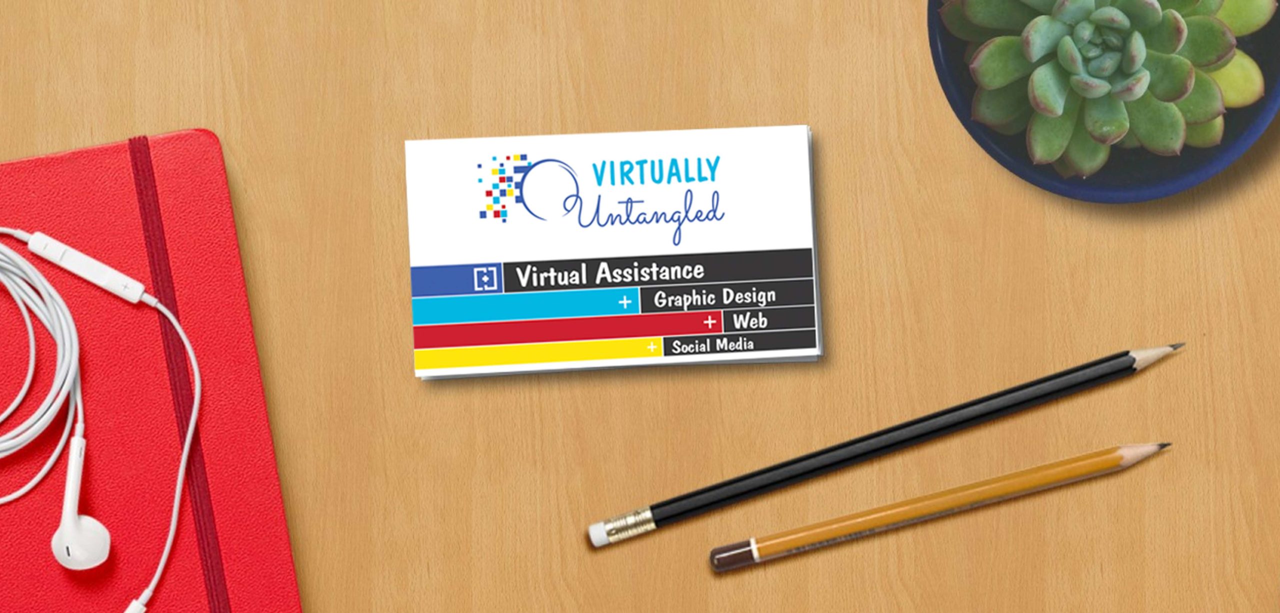
7. Lack of White Space
White space, also known as negative space, is the empty area surrounding the elements on your business card. Some business cards suffer from a lack of white space, which makes the design feel cramped and overwhelming.
Solution: Embrace white space to create a clean and visually appealing design. Proper use of white space helps bring focus to the important elements and enhances readability. Give each element room to breathe, and avoid cluttering your card.
Conclusion
Business cards play a crucial role in networking and making a remarkable first impression. However, when they fall victim to these common design mistakes, they end up on the list of the worst business cards.
To ensure your business cards avoid such a fate, keep the design clean, minimalist, and consistent with your brand identity. Choose easily readable fonts, high-quality printing, and include all essential contact information. Lastly, get creative and use white space effectively to make your business card visually appealing and memorable.
By avoiding these design fails, you can create business cards that will leave a positive and lasting impression on potential clients and customers. Remember, a well-designed business card is a powerful tool in the business world, so take the time to get it right!
William’s writing reflects a deep passion for graphic design and marketing. With a background in the visual arts, he adds a unique perspective to his content. In his spare time, William enjoys visiting art galleries and seeking out the latest design trends.