Are you looking for a way to make a lasting impression with your business cards? Typography can be the key to creating unique and memorable designs that will set you apart from the competition. In this article, we will explore the importance of typography in business cards and provide you with some practical tips and ideas to create stunning designs. Let’s dive in!
The Power of Typography in Business Cards
Typography plays a vital role in communication. It involves the art and technique of arranging type to make the written language readable and visually appealing. When properly utilized in business cards, typography can evoke emotions, convey professionalism, and showcase your brand’s personality.
Your choice of typography can speak volumes about your business. Fonts have their own personalities and convey different meanings and associations. For example, using a clean and modern sans-serif font portrays a contemporary and professional image, while a script font can evoke elegance and sophistication.
Typography also impacts the readability of your business card. The right font size, spacing, and alignment will determine if your information is easily legible or a visual jumble. Opt for fonts that are clear and easily readable, even at smaller sizes.
Tips for Choosing Typography for Business Cards
1. Reflect Your Brand Identity
Your typography choices should align with your brand identity. Consider the nature of your business, your target audience, and the overall image you want to convey. If your brand is playful and energetic, you might want to consider using bold and creative fonts. On the other hand, if you have a more serious and professional brand, you might opt for conservative and refined typography.
2. Create Hierarchy with Typography
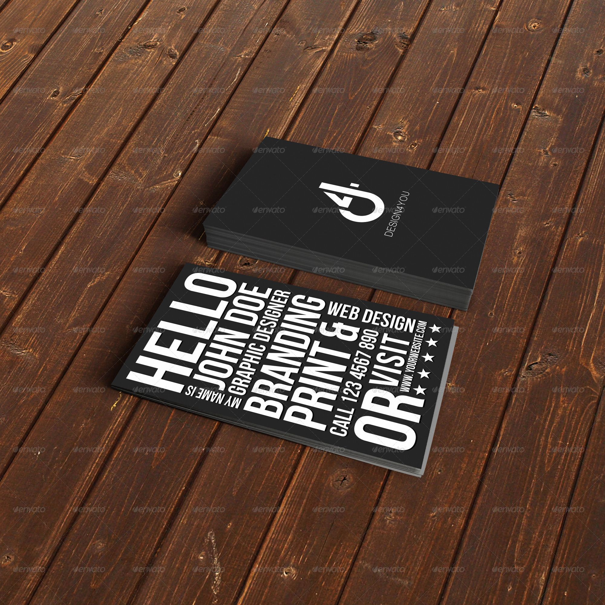
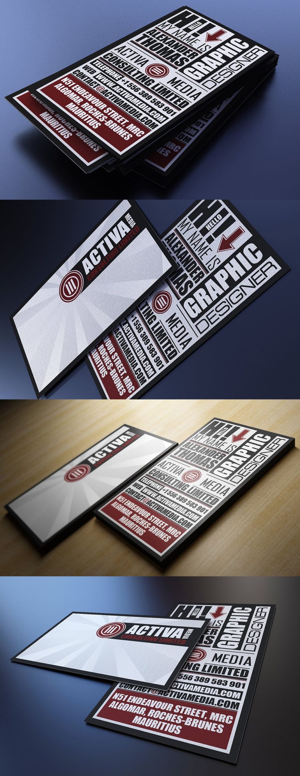
Hierarchy is important when designing business cards. It helps guide the viewer’s eyes through the information and emphasizes the most important details. Varying font weights, sizes, and styles can establish a clear hierarchy. For example, use a larger and bolder font for your name or company name to make it stand out, while using a smaller font for contact information.
3. Use Complementary Fonts
Selecting a combination of fonts that work well together is crucial. Avoid using too many different fonts as it can create visual chaos and make your business card look unprofessional. Instead, choose two to three fonts that complement each other. Pairing a sans-serif font with a serif font often creates a pleasing contrast.
4. Consider Legibility and Readability
Never compromise legibility for the sake of creativity. It’s essential that the text on your business card is easily readable. Avoid using overly decorative or elaborate fonts that may be difficult to decipher. Test your design by printing a sample and ensure that all information is clear and easy to read at a glance.
Typography Ideas for Unique and Memorable Business Cards
Now that we have discussed the importance of typography in business cards, let’s explore some design ideas that can help you create impressive designs:
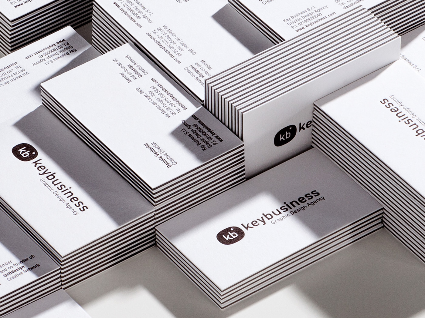
1. Minimalistic Elegance
Create an elegant and minimalistic business card by using a clean and simple serif font for your name, combined with a subtle sans-serif font for the rest of the information. Opt for a design with ample white space to highlight the typography and create a sophisticated look.
2. Playful and Creative
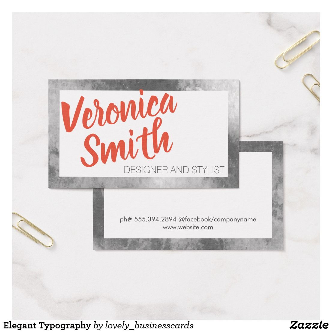
If you’re in a creative industry such as graphic design or fashion, consider using bold and creative fonts to showcase your artistic side. Experiment with different typography styles, hand-drawn fonts, or vintage-inspired typefaces to create a visually striking business card.
3. Classic and Timeless
For a classic and timeless look, choose a traditional serif font for your business card. This font style brings a sense of tradition and reliability to your design. Combine it with carefully chosen colors and textures to create a stylish and memorable business card.
4. Geometric Modernity
If you want to project a modern and contemporary image, consider using geometric fonts. These fonts provide a sleek and cutting-edge look. Combine them with vibrant colors, clean lines, and minimalist designs to create a stand-out business card.
Conclusion
Typography is a powerful tool when it comes to designing business cards. It not only enhances the visual appeal of your cards but also conveys your brand personality and helps create a lasting impression. By carefully selecting typography that reflects your brand, creating hierarchy, considering legibility, and exploring different design ideas, you can create unique and memorable business cards that leave a lasting impact on recipients. So, go ahead and experiment with typography to make your business cards truly stand out in a crowded marketplace.
Samuel Anderson, a branding connoisseur, brings his knack for design and a strong marketing background to the forefront. He’s a voracious reader and enjoys delving into psychology, which he incorporates into his marketing strategies for business cards and brand development.