
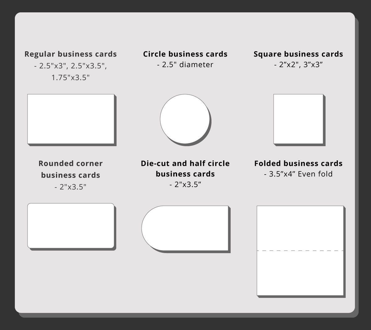
When it comes to creating a business card, there are several important factors to consider. The design, color scheme, and content all play a significant role in creating a memorable and professional card. However, one often overlooked aspect is the text size. Finding the perfect balance between readability and aesthetics is crucial to ensure that your business card stands out and effectively communicates your message. In this article, we will explore the importance of text size for business cards and provide some guidelines to help you make the right decision.
The Significance of Text Size
The text size on your business card is a critical component that can greatly impact how your information is perceived. If the text is too small, it can be difficult to read, especially for individuals with visual impairments or older adults. On the other hand, if the text is too large, it may give the impression of a lack of professionalism or sophistication. Therefore, striking the right balance with text size is essential to create a visually appealing and effective business card.
Considerations for Choosing the Right Text Size
1. Legibility
The primary purpose of your business card is to convey essential information about your business or personal brand. If your text size is too small, it may be illegible and fail to fulfill its purpose. Remember that business cards are typically small in size, so it’s crucial to choose a text size that is easy to read at a glance. Avoid fonts that are too thin or intricate, as they can further hinder legibility. Opt for clean, bold fonts that are large enough to ensure clarity.
2. Hierarchy and Information Structure
Often, there is limited space available on a business card, making it important to prioritize the content. The text size can help establish a visual hierarchy and guide the reader’s attention to the most important information. Consider using larger text sizes for your name and job title, while reducing the size for secondary details such as contact information or social media handles. By structuring your text size effectively, you can highlight the key elements and create a clear information flow.
Guidelines for Choosing the Right Text Size
Now that we understand the significance of text size and the considerations that factor into the decision-making process, let’s explore some guidelines to help you choose the right text size for your business cards:
1. Optimal Font Sizes
The optimal font size for your business card will depend on the font style and the amount of text you need to include. As a general rule, consider using a font size between 8 to 12 points for smaller cards and up to 14 points for larger ones. However, keep in mind that these are just starting points, and you should adapt them to your specific design and layout. Always print a test card to ensure that the font size is readable in the final product.
2. Consider the Printing Technique
The printing technique you choose can also have an impact on the legibility of your business card text. Offset printing tends to be sharper and more precise compared to digital printing. If you opt for digital printing, consider using fonts with thicker strokes and larger text sizes to compensate for any potential loss of sharpness. Understanding the limitations and characteristics of your chosen printing technique will help you make the appropriate adjustments to your text size.
3. Keep It Consistent
Consistency in text size across your business card is key to creating a visually appealing design. Aim to maintain a balance between different elements, such as your name, contact information, and any additional details. By using a consistent font style and size, you can ensure that your business card looks polished and professional.
4. Consider Your Target Audience
When deciding on the text size for your business card, always keep your target audience in mind. Think about their age group and any specific visual impairments they may have. If your business caters to older individuals or people with visual limitations, it may be necessary to increase the font size further to enhance readability.
5. Seek Feedback
Lastly, before finalizing the text size on your business card, seek feedback from others. Ask colleagues, friends, or family members to review your design and provide their honest opinions. Their feedback can provide valuable insights into readability and overall aesthetics, helping you make any necessary adjustments to optimize the impact of your business card.
Conclusion
In conclusion, finding the right text size for your business cards is crucial for creating a visually appealing, professional, and effective marketing tool. By considering legibility, information structure, optimal font sizes, printing techniques, consistency, target audience, and seeking feedback, you can strike the perfect balance and ensure that your business card leaves a lasting impression. Remember, the goal is to create a card that is easy to read while maintaining a visually appealing design that reflects your personal or business brand. So, take the time to carefully choose the text size, and watch your business card make a lasting impact.
Isabella, a branding guru, merges her love for storytelling with her marketing expertise. Her fascination with cultural diversity and travel lends a global perspective to her writing about business cards and graphic design. In her free time, she explores new cuisines and documents her culinary adventures.