As a business professional, you understand the importance of making a memorable first impression. One of the key elements of any business card is the font size used for your contact information and company details. Choosing the right font size can greatly impact the readability and overall effectiveness of your business cards. In this comprehensive guide, we will explore the standard font size for business cards and provide you with useful insights to create professional and aesthetically appealing designs.
Importance of Font Size on Business Cards
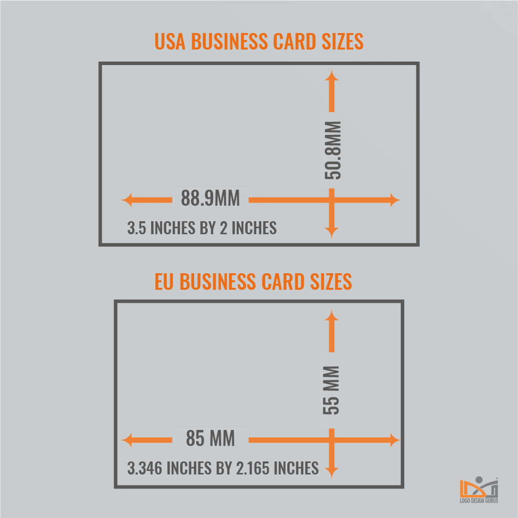
The font size on your business card plays a crucial role in conveying information effectively. It determines the legibility of your contact details and can influence how people perceive and remember your brand. Using a font size that is too small may make it difficult for potential clients or business partners to read your information, while using a font size that is too large can make your card appear unprofessional and cluttered.
Determining the Right Font Size
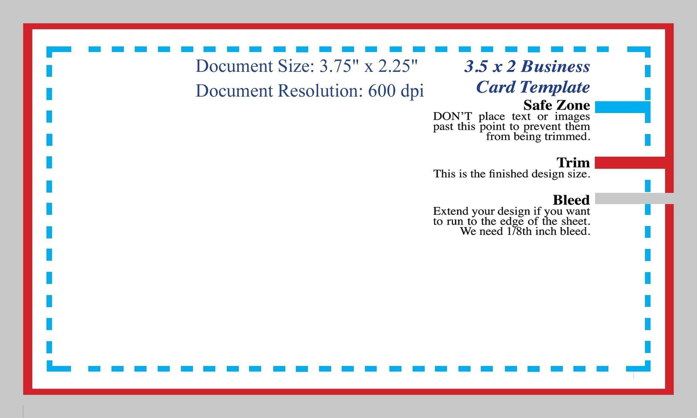
When selecting the font size for your business cards, it is important to strike a balance between readability and aesthetics. Here are some factors to consider when determining the right font size:
1. Readability:
Prioritizing readability is crucial when choosing the font size for your business cards. While it may be tempting to opt for a smaller font size to fit more information on the card, keep in mind that if the text is too small, it will become illegible. It is essential to ensure that your contact details, such as your name, phone number, and email address, are easily readable at a glance.
2. Usability:
Consider the target audience and their age group when deciding the font size for your business cards. Older individuals may have difficulty reading small text, so it is advisable to choose a larger font size in such cases. On the other hand, if your target audience consists mainly of tech-savvy individuals who are accustomed to reading smaller text on digital devices, you can opt for a slightly smaller font size.
3. Brand Identity:
The font size you choose should align with your brand identity and overall aesthetic. If your business card design is sleek and minimalist, a smaller font size may complement the design. However, if your brand is bold and vibrant, a larger font size can help to emphasize and reinforce your brand personality.
Standard Font Sizes for Business Cards
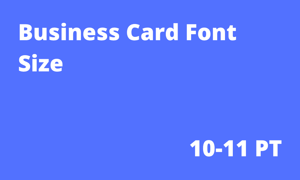
Although there isn’t a universally accepted standard font size for business cards, there are some commonly used sizes that tend to work well for different purposes. Here are the recommended font sizes for different types of information on your business cards:
1. Name:
Your name is the most important element on your business card, and as such, it should stand out. A font size of 10 to 12 points for the name is generally considered appropriate. This size ensures that your name is prominent and easily readable without overwhelming the rest of the design.
2. Company Name and Title:
The font size for your company name and title should be slightly smaller than your name but still noticeable. A font size of around 8 to 10 points usually works well for this purpose. It allows the information to be easily read without overshadowing the rest of the design elements.
3. Contact Details:
For the contact details such as phone number, email address, and website, a font size of approximately 7 to 8 points is commonly used. This size ensures that the information is legible without taking up excessive space on the card.
4. Additional Information:
If you choose to include additional details on your business card, such as social media handles or a tagline, a font size of 6 to 7 points is typically appropriate. It is essential to maintain readability while ensuring that these elements do not overpower the rest of the design.
Tips for Choosing and Using Fonts
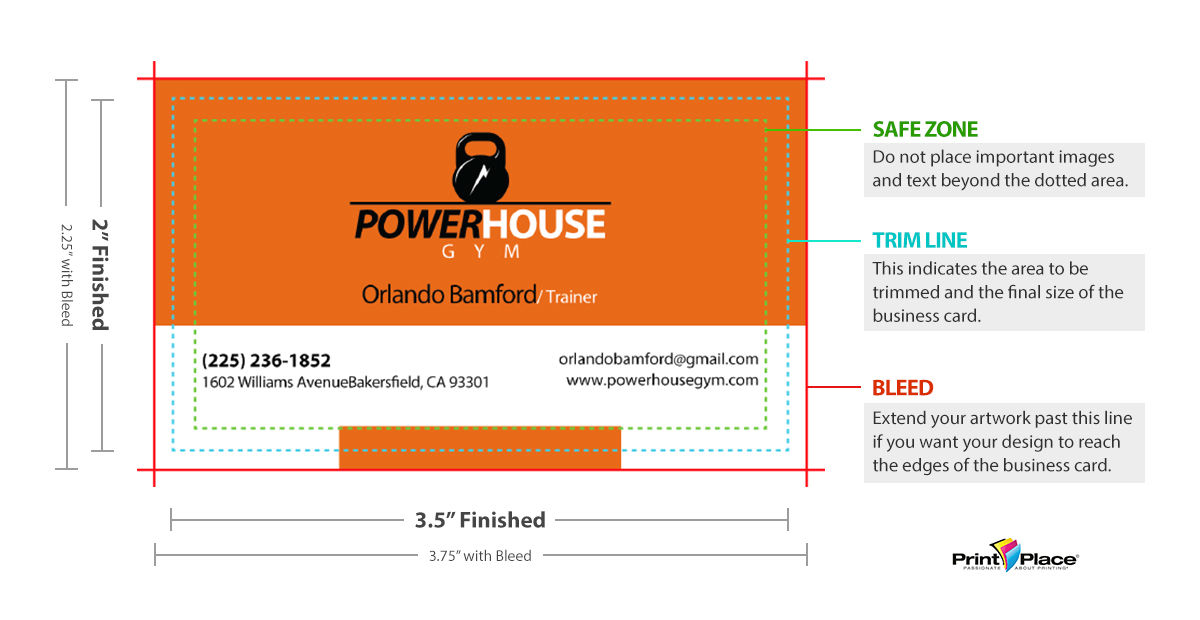
When selecting fonts for your business cards, it is crucial to choose ones that are not only visually appealing but also highly legible. Here are some tips to keep in mind:
- Choose a font family that includes both a regular and a bold variant. This allows you to emphasize important information such as your name or company name while maintaining consistency in your design.
- Avoid using decorative or overly stylized fonts for essential information. While these fonts may be visually appealing, they can often sacrifice readability.
- Opt for a font that is easy to read in both print and digital formats. Some fonts may look great on a computer screen but lose clarity when printed in smaller sizes.
- Ensure that there is sufficient contrast between the font and the background color of your business card. This will enhance readability and prevent strain on the eyes.
Conclusion
In conclusion, selecting the appropriate font size for your business cards is essential for creating a professional and visually appealing design. Remember to prioritize readability and usability when choosing the font size, and ensure that it aligns with your brand identity. By following the recommended font sizes and considering the tips provided, you can design business cards that effectively convey your contact information and make a lasting impression on your target audience.
Olivia Reynolds, a marketing maven, is passionate about the impact of graphic design on brand success. Her love for outdoor adventures and travel fuels her fresh perspective on the importance of visual aesthetics in business cards and branding.