As a professional, your business card often serves as the first impression potential clients and contacts have of you and your business. It’s essential to choose a font that conveys your professionalism, personality, and brand accurately. With numerous font options available, finding the right one can be overwhelming. This article will guide you through the process of selecting professional fonts for business cards that will make a lasting impact.
The Role of Fonts in Business Cards
Fonts play a crucial role in communicating the essence of your brand. They have the power to evoke emotions and convey specific messages to viewers. When it comes to designing your business card, the font you choose can greatly influence how it is perceived. Whether you’re aiming for professionalism, elegance, modernity, or creativity, the right font can help you achieve your desired outcome.
Consider Your Brand Identity
Before diving into the world of fonts, it’s vital to understand your brand identity. Consider the nature of your business, your target audience, and the image you want to project. Are you in a traditional industry such as finance or law? Or are you in a creative field like graphic design or photography? Your font choice should align with your industry and brand personality.
Choosing Serif Fonts for Elegance and Tradition
Serif fonts are often associated with elegance, tradition, and authority. These fonts have small strokes, known as serifs, at the end of each character, which add sophistication to the overall design. Serif fonts are a popular choice for industries such as legal services, finance, and luxury brands, where professionalism and trustworthiness are paramount.
Some timeless serif options suitable for business cards include:
- Times New Roman: A classic serif font known for its readability and timeless appeal. It exudes professionalism, making it a popular choice for legal professionals.
- Georgia: Created specifically for screen readability, Georgia offers a balance between contemporary and traditional. It is an excellent choice for industries like journalism or creative writing.
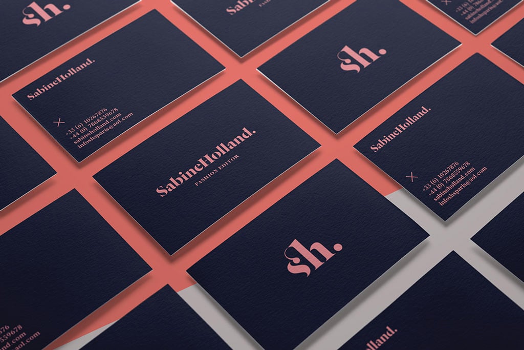
- Baskerville: With its elegant and refined appearance, Baskerville is often associated with luxury and high-end brands. It’s an excellent font option for creative industries looking to convey sophistication and exclusivity.
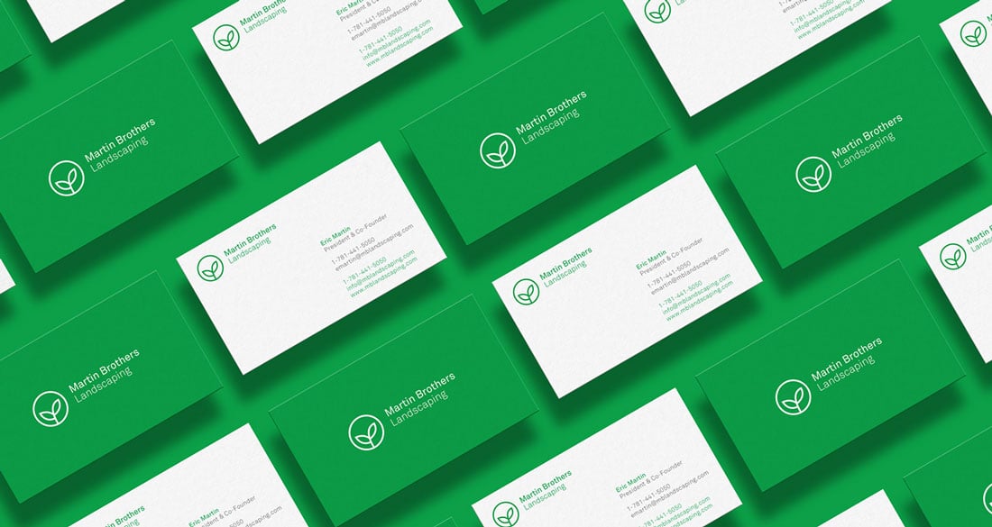
Opting for Sans Serif Fonts to Portray Modernity and Simplicity
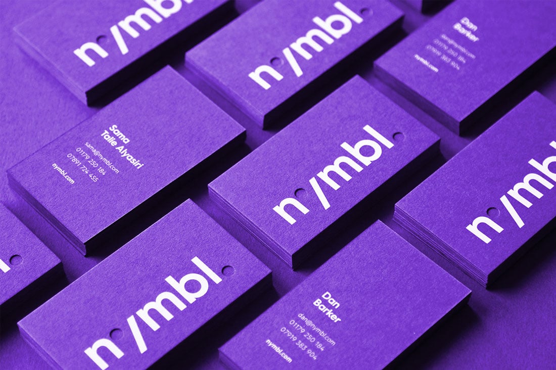
If you’re looking to portray a modern, clean, or minimalist vibe, sans serif fonts might be the perfect fit for your business card. Sans serif fonts are characterized by their clean lines and lack of serifs, giving them a contemporary edge. They are often used by technology companies, modern startups, and creative industries.
Consider these popular sans serif fonts for your business card design:
- Helvetica: One of the most widely used typefaces globally, Helvetica is a reliable choice for its clean and timeless design. It offers ultimate versatility, making it suitable for various businesses and industries.
- Arial: Similar to Helvetica, Arial is widely available and readable at small sizes. It is often used in digital and technology-related fields due to its modern appearance.
- Roboto: Created specifically for digital interfaces, Roboto is a popular choice for businesses with a strong online presence. It offers a contemporary feel and excellent readability across screens and print.
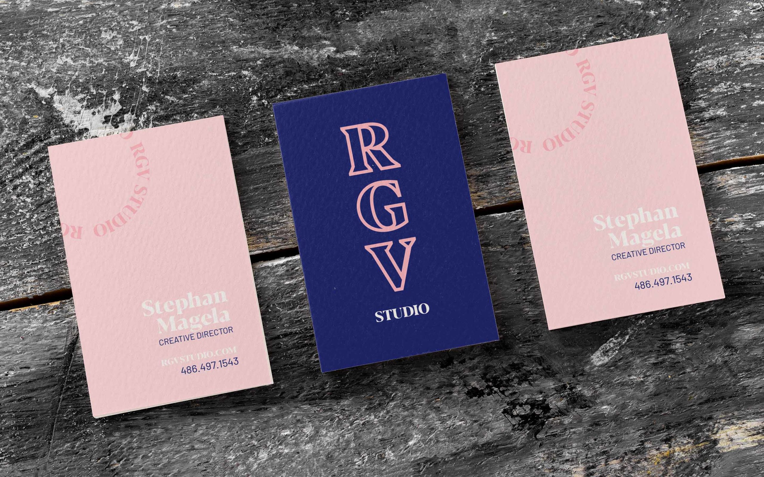
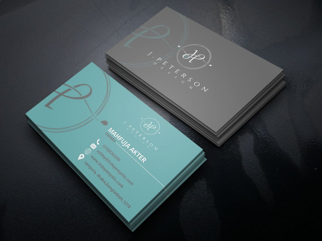
Exploring Display Fonts for Creative Impact
Sometimes, you may want your business card to stand out from the crowd or reflect the creativity of your industry. This is where display fonts come into play. Unlike serif and sans serif fonts, display fonts are often more decorative, attention-grabbing, and unique. They can add personality and distinguish your brand from competitors.
Here are some notable display font options to consider:
- Bebas Neue: Bebas Neue is a bold, all-capitals font that adds a strong visual impact. It is commonly used in industries like fashion, photography, and architecture, where creativity and personality take center stage.
- Lobster: Lobster offers a playful, hand-drawn appearance. Its distinctive curves create a friendly and approachable vibe. It is an excellent option for businesses involved in crafts, food, or any industry targeting a younger audience.
- Brush Script: As the name suggests, Brush Script mimics handwritten brushstrokes. It adds a personal touch and is often used by artists, stylists, and designers looking to showcase their creative flair.
Balancing Legibility and Design
While it’s crucial to choose a font that aligns with your brand identity, it’s equally important to ensure it is legible and easily readable. Regardless of the font style you choose, make sure it’s suitable for small sizes and various print materials.
Consider the following tips to ensure optimal legibility:
- Opt for readable font sizes: Choose a font size that allows your text to be clearly legible without straining the reader’s eyes. Avoid fonts that become unreadable when scaled down.
- Contrasting font colors: Ensure there is a sufficient contrast between the font color and the background. A high contrast color combination will enhance readability, especially in low light conditions.
- Test different print materials: Remember to test your font on various print materials to ensure clarity and legibility. What may look perfect on your computer screen may not translate well onto a business card or other physical materials.
Taking Inspiration from Successful Business Cards
Looking at well-designed business cards from successful professionals in your industry can provide inspiration for your own font choices. Analyze the typography they use, and consider how it aligns with their branding and target audience. While you should never copy someone else’s design outright, drawing inspiration can help you better understand what works for your industry.
Conclusion
Selecting the perfect professional font for your business cards is a vital step in building your brand identity and making a lasting first impression. Whether you opt for a serif font for elegance, a sans serif font for modernity, or a display font for creativity, make sure it aligns with your brand personality and legibility requirements. Remember, your business card represents you and your business, so choose wisely and confidently.
Samuel Anderson, a branding connoisseur, brings his knack for design and a strong marketing background to the forefront. He’s a voracious reader and enjoys delving into psychology, which he incorporates into his marketing strategies for business cards and brand development.