
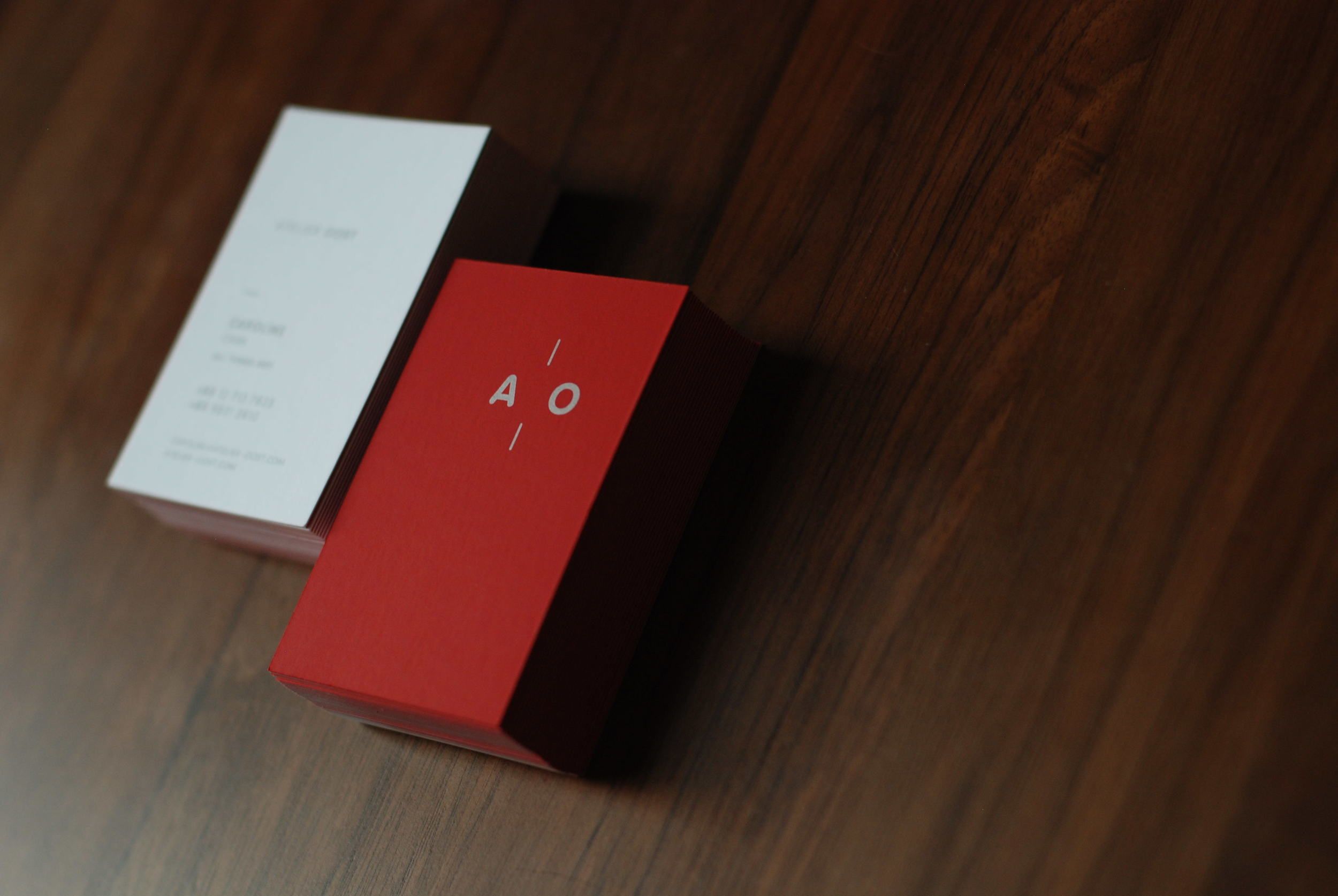
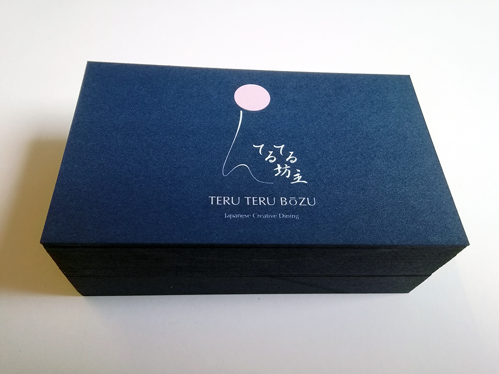
Business cards have long been a staple in the world of networking and professional relationships. They serve as a tangible representation of who you are, what you do, and how to get in touch with you. But in a sea of standard white and beige cards, how can you make sure yours stands out from the crowd? One way to make a lasting impression is with Pantone business cards.
What are Pantone Business Cards?
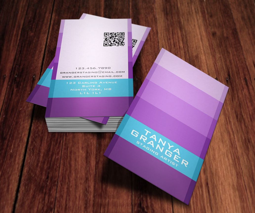
Pantone is a company that revolutionized the world of color communication and management. They developed a proprietary system that allows for accurate and consistent color representation across various industries, including graphic design, fashion, and printing. Pantone business cards utilize this system to create vibrant and eye-catching designs.
The Benefits of Pantone Business Cards
Using Pantone colors in your business cards offers several advantages:
- Color Accuracy: Pantone ensures that the colors on your business cards will be consistent and accurate, regardless of the printing process or materials used. This reliability is especially crucial if you have specific brand colors that need to be accurately represented.
- Stand Out from the Crowd: With a Pantone business card, you can create striking designs that catch the eye and leave a lasting impression. By utilizing vibrant and unique colors, you differentiate yourself from competitors and make your card memorable.
- Brand Consistency: If your brand has specific colors associated with it, using Pantone can help maintain consistency across all your marketing materials. From your logo to your website to your business cards, Pantone ensures that the colors are always consistent, enhancing brand recognition.
- Professionalism: Pantone business cards exude professionalism and attention to detail. By investing in high-quality design and printing techniques, you show potential clients or partners that you take your business seriously.
The Design Process
Designing Pantone business cards follows a similar process to traditional business cards. However, the focus is on selecting and implementing Pantone colors effectively. Here’s a step-by-step guide to creating Pantone business cards:
Step 1: Choose Your Colors
The first step is to select the Pantone colors that align with your brand or desired aesthetic. Pantone provides a comprehensive color matching system that allows you to browse and choose from thousands of colors. Consider factors such as color psychology, your industry, and any existing brand guidelines when making your selection.
Step 2: Work with a Designer
Unless you have extensive design experience, it’s recommended to work with a professional graphic designer who is familiar with Pantone’s color system. They will help bring your vision to life while ensuring the colors are accurately represented in the design files.
Step 3: Design the Layout
Building an effective layout is crucial for your business cards. Consider the information you want to include (name, title, contact details), and how the colors will be incorporated into the design. Remember to keep the overall design clean and legible while emphasizing the Pantone colors to make a statement.
Step 4: Printing
Once the design is finalized, it’s time to send it off to a professional printer that specializes in Pantone printing. They will use the Pantone color system to ensure accurate color reproduction. Be sure to discuss any special finishes or paper options that can enhance the final result.
Using Pantone Business Cards Effectively
To make the most of your Pantone business cards, consider the following tips:
- Consider Color Psychology: Understand the emotions and associations that different colors evoke. Use this knowledge to choose Pantone colors that align with your brand values and target audience.
- Maintain Consistency: Use the same Pantone colors across all your marketing materials, including your website, social media profiles, and marketing collateral. Consistency is key to creating a strong and recognizable brand identity.
- Highlight Key Elements: Pantone colors can be used strategically to draw attention to specific elements on your business card. Consider highlighting your logo or contact details with striking colors that stand out from the rest of the design.
- Experiment with Complementary Colors: Pantone offers a wide array of colors that work well together. Experiment with complementary colors to create visually appealing and harmonious designs.
Conclusion
In a world where first impressions matter, Pantone business cards allow you to make a memorable impact. By leveraging the precision and vibrance of Pantone colors, you can create an unforgettable business card that reflects your brand’s personality and professionalism. Don’t settle for ordinary business cards when you have the opportunity to showcase your unique style and creativity with Pantone. Take your networking game to the next level with Pantone business cards, the perfect combination of color and style.
William’s writing reflects a deep passion for graphic design and marketing. With a background in the visual arts, he adds a unique perspective to his content. In his spare time, William enjoys visiting art galleries and seeking out the latest design trends.