
Are you looking for a versatile and sophisticated option for your business cards? Look no further than gray business cards. Gray is a color that exudes elegance, professionalism, and modernity. It is a neutral color that can complement any brand or design, making it a popular choice for those who want to make a statement without being too flashy. In this article, we will explore the benefits and versatility of gray business cards, as well as provide some tips on how to design them effectively.
The Power of Gray
Gray is often associated with qualities such as stability, intelligence, and reliability. It is a color that can convey a sense of seriousness and professionalism. With gray business cards, you can create a strong first impression and leave a lasting impact on your potential clients and partners.
Versatility and Compatibility
One of the greatest advantages of gray business cards is their versatility. Gray is a neutral color that can seamlessly blend with any other color or design elements. Whether you choose to pair it with bold and vibrant colors, or with more muted and subtle tones, gray will provide a solid foundation for your design, allowing other elements to shine.
Subtlety and Sophistication
Gray business cards are perfect for those who want to convey a sense of elegance and sophistication. Unlike more vibrant colors that can sometimes be seen as flashy or unprofessional, gray exudes a sense of understated confidence. It is a color that is often associated with luxury and high-end brands. By choosing gray for your business cards, you can elevate your brand image and create a memorable impression while maintaining a sense of professionalism.
Designing Effective Gray Business Cards
Now that we’ve established the benefits of gray business cards, let’s explore some tips on how to design them effectively.
1. Choose the Right Shade of Gray
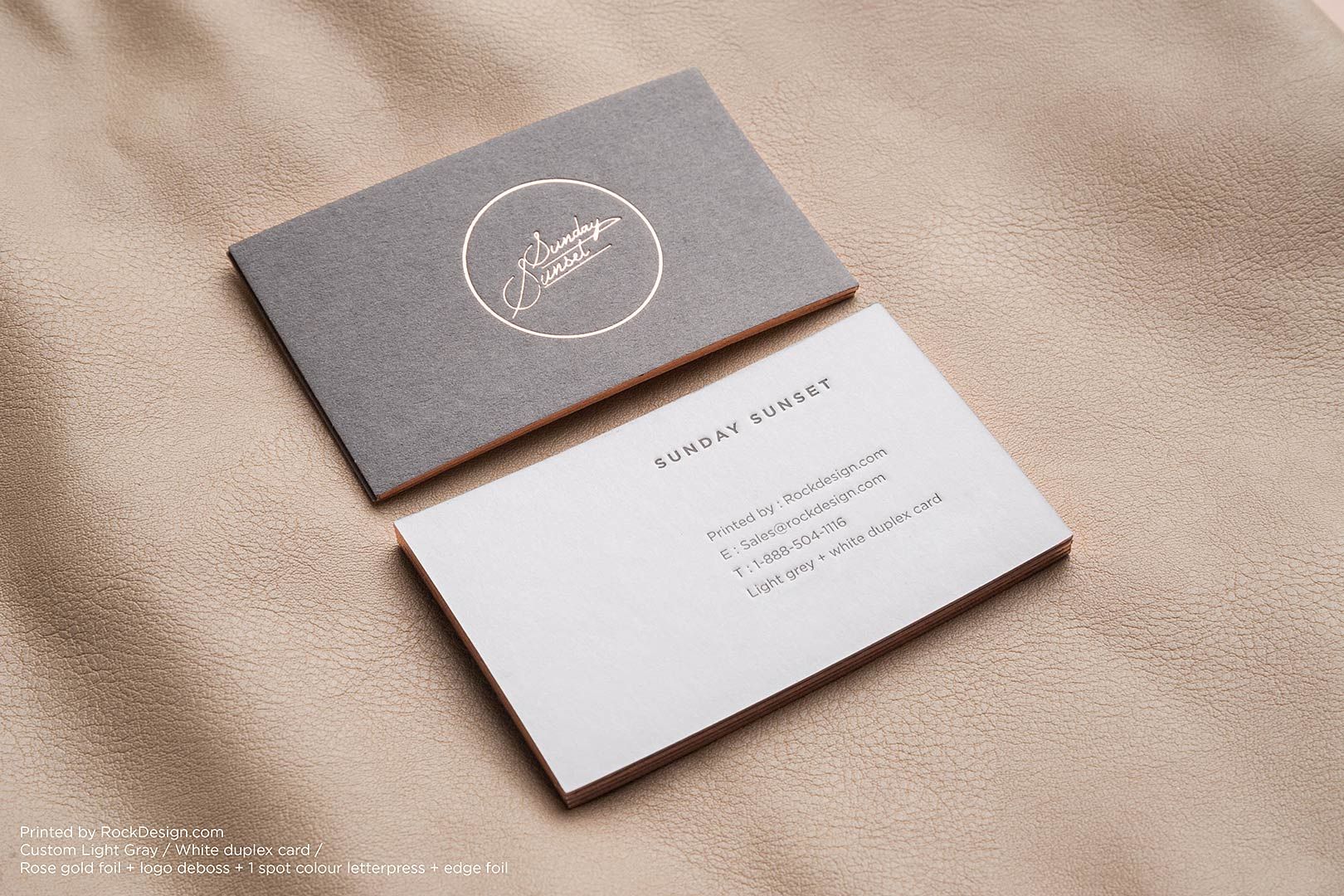
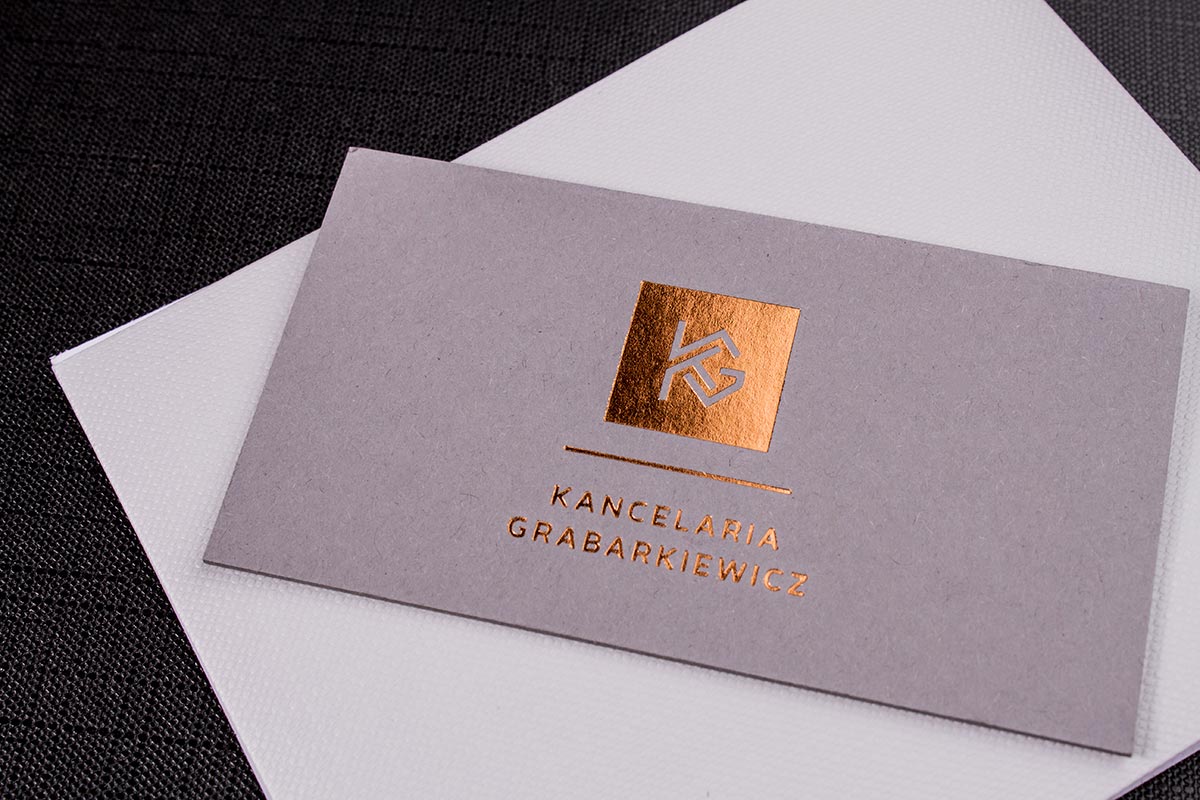
There are numerous shades of gray to choose from, ranging from light silver to deep charcoal. The shade of gray you select will depend on your brand identity and the message you want to convey. Lighter shades of gray can create a softer and more approachable look, while darker shades can add a touch of sophistication and mystery. Experiment with different shades to find the one that best represents your brand.
2. Consider Texture and Finish
Texture and finish can greatly impact the overall look and feel of your gray business cards. Consider using a textured paper or adding embossed details to create a tactile experience. Additionally, you can opt for a glossy finish to add a touch of modernity, or a matte finish for a more elegant and understated look. The choice of texture and finish should complement your design and enhance the desired impression.
3. Keep It Simple and Clean
Gray business cards often work best when the design is kept clean and simple. Avoid overcrowding the card with excessive text or graphics. Instead, focus on key information such as your name, job title, contact details, and logo. Make sure the text is legible and choose a font that aligns with your brand image. When it comes to design, less is often more.
4. Add a Pop of Color
While gray business cards can certainly stand on their own, adding a pop of color can make them even more visually appealing. Consider incorporating your brand’s accent color or a color that represents your industry to create contrast and catch the viewer’s attention. However, be mindful not to overpower the gray background. The pop of color should enhance the design, not overshadow it.
5. Don’t Forget about the Back
The back of your gray business card is valuable real estate that should not be ignored. Consider utilizing it to showcase additional information, such as a brief company bio, a tagline, or even a testimonial. The back of the card can also provide an opportunity to add visual interest with patterns or a textured background. Be creative, but ensure that the back design complements the front and maintains a cohesive look.
Conclusion
Gray business cards offer a stylish and timeless option for professionals who want to make a lasting impression without being too flashy. The versatility and compatibility of gray make it a great choice for any brand, while the subtlety and sophistication it brings to the table ensure that your business cards will stand out in a crowd. By carefully considering shade, texture, and finish, and keeping the design clean and simple, you can create gray business cards that are both visually appealing and highly effective. So why wait? Embrace the power of gray and elevate your business card game today.
William’s writing reflects a deep passion for graphic design and marketing. With a background in the visual arts, he adds a unique perspective to his content. In his spare time, William enjoys visiting art galleries and seeking out the latest design trends.