Do you want to create a professional and eye-catching business card that leaves a lasting impression on potential clients? One crucial aspect to consider is the font size. The font size you choose can significantly impact the readability and overall effectiveness of your business card. In this comprehensive guide, we will explore the importance of font sizes for business cards and provide you with some valuable tips on how to choose the right font size for your specific needs.
Why Font Sizes Matter for Business Cards
When it comes to business cards, your goal is to convey information clearly and effectively. This requires selecting fonts that are legible and appropriate for the purpose of your card.
Legibility is Key
The primary function of a business card is to provide essential contact information to potential clients or customers. If your font size is too small, people may struggle to read your contact details, leading to missed opportunities and potential loss of business. On the other hand, if your font size is too large, it can make your card look unprofessional and crowded.
Visual Hierarchy and Scannability
Choosing the right font sizes for the different elements on your business card also helps establish a visual hierarchy. By varying the size of the fonts, you can guide the viewer’s eyes to specific information in a clear and logical manner. It also enhances the scannability of your card, making it easier for people to quickly find the information they need.
Reflecting Your Brand
Font sizes play a significant role in reflecting your brand’s personality and professionalism. Different font sizes convey different emotions and impressions. For example, a larger, bold font can signify confidence and authority, while a smaller, elegant font may portray sophistication and subtlety.
Factors to Consider When Choosing Font Sizes
Now that we understand the importance of font sizes for business cards, let’s delve into some factors to consider when selecting the appropriate font sizes for each element of your card.
1. Text Type and Purpose
The font size you choose should align with the purpose and style of your business card. If you’re designing a minimalistic card with just your name and contact information, you can opt for a larger, attention-grabbing font size. However, if your business card includes additional details such as job title, address, or social media handles, you’ll need to balance the font sizes to ensure legibility.
2. Readability
While it’s important to be creative, it’s equally crucial to prioritize readability. Consider the smallest font size that is comfortably readable for most people. A good rule of thumb is to use a font size that is no smaller than 8 points to ensure legibility, especially for those with visual impairments or older individuals.
3. Hierarchy of Information
Business card design often follows a hierarchical structure, with the most critical information (like the name and company) receiving the most prominent font size. Lesser important details like job titles, phone numbers, and email addresses should have slightly smaller font sizes. By creating this visual hierarchy, you guide the recipient’s eyes to the most crucial elements first.
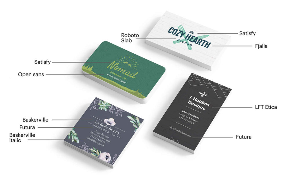
4. Typeface and Font Styles
The typeface you choose can also influence the perceived size of a font. While some typefaces appear larger than others at the same point size, certain font styles (such as bold or italic) can also make text appear more prominent. Experiment with different combinations to find the right balance between legibility and visual appeal.
Best Practices for Font Sizes
Now that we’ve discussed the importance of font sizes and the factors to consider when choosing them, let’s explore some best practices to ensure your business card is visually appealing and effectively communicates your message.
1. Stick to a Maximum of Three Font Sizes
Using too many font sizes can make your business card look cluttered and unprofessional. Ideally, limit your design to a maximum of three font sizesâ_x0080__x0094_one for the most important information, another for secondary details, and a third for fine print (like addresses or social media links).
2. Consider Font Size Variations within a Typeface
Instead of using multiple typefaces, try playing with variations of a single typeface to create visual interest. Varying the weight (light, regular, bold) or style (italic, condensed) can help you distinguish between different elements while maintaining consistency in your overall design.
3. Use Contrasting Font Sizes for Hierarchy
To establish a clear hierarchy, contrast the sizes of your fonts. The most crucial information should be noticeably larger than supporting details. Experiment with different font sizes to find the right balance.
4. Test for Legibility
Always test the legibility of your font sizes, especially if you’re using a non-standard or decorative typeface. Print a few sample cards and ask others for their feedback. Ensure the fonts are easy to read under various lighting conditions and distances.
5. Consider the Medium and Printing Techniques
Keep in mind that the final printed version of your business card may vary slightly from what you see on your computer screen. Different printing techniques and mediums can affect the perceived size and legibility of your fonts. Consult with a professional printer to ensure your font sizes translate well to the final product.
Conclusion

The font sizes you choose for your business card can significantly impact its effectiveness. By prioritizing legibility, considering the purpose and hierarchy of information, and following best practices, you can create a visually appealing and professional card that effectively communicates your message. Experiment with different font sizes, test for legibility, and don’t hesitate to seek feedback from others. Remember, a well-designed business card can leave a lasting impression and open doors to new opportunities.
So, whether you’re starting a new business or updating your existing card, take the time to evaluate the font sizes for your business cards, and ensure they align with your brand’s image and communication goals.
Olivia Reynolds, a marketing maven, is passionate about the impact of graphic design on brand success. Her love for outdoor adventures and travel fuels her fresh perspective on the importance of visual aesthetics in business cards and branding.