When designing a business card, one crucial element to consider is the font size. The font size determines how easily the information on the card can be read, and it plays a significant role in creating a professional and visually appealing design. In this guide, we will explore the importance of font size on business cards and provide some best practices to help you make informed decisions while creating your own.
Why Font Size Matters on Business Cards
The font size on a business card is essential because it directly affects the legibility and overall clarity of the information presented. A font size that is too small may strain the reader’s eyes and make it difficult to comprehend the details, while a font size that is too large may result in a cluttered and unprofessional appearance. Balancing the font size ensures that your business card is visually appealing while remaining information-rich.
Enhancing Legibility
The primary purpose of a business card is to provide contact information, so it is crucial to choose a font size that makes the text readable. Your potential clients or customers should be able to quickly and effortlessly find relevant details, such as your name, phone number, email address, and company name. By selecting an appropriate font size, you can ensure that the information is legible, even at a quick glance.
Making a Lasting Impression
Business cards serve as a representation of your professionalism and attention to detail. When recipients of your card find it easy to read and visually pleasing, it creates a positive first impression. Conversely, a business card with tiny, hard-to-read text can be frustrating and may leave a negative impression on potential clients or customers. By carefully selecting the font size, you can create a visually striking business card that leaves a lasting impression on anyone who receives it.
Factors to Consider for Optimal Font Size
While there is no one-size-fits-all approach to determining the ideal font size for business cards, several factors can help guide your decision-making process. Consider the following factors when choosing the font size:
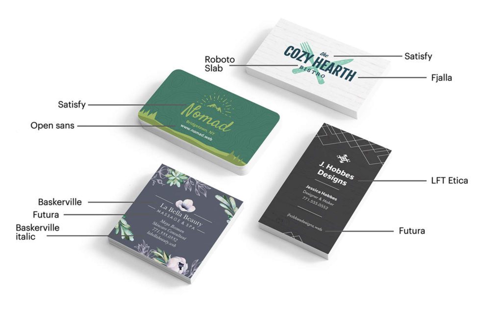
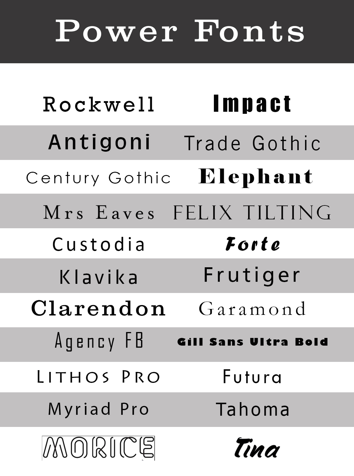
Font Style
Different font styles have varying levels of legibility at different sizes. Some fonts may appear large even at smaller sizes, while others may require a larger font size to ensure legibility. As you select the font for your business card, test various sizes to determine which ones work best with your chosen font style.
Card Size
The physical dimensions of your business card play a crucial role in determining the optimal font size. If you have a standard-sized business card, there may be limitations on how much text can be comfortably placed on it. This restriction may require you to choose a slightly smaller font size to fit all the necessary information without overcrowding the card.
Information Hierarchy
When designing your business card, it is vital to consider the hierarchy of the information you want to include. Not all details on a business card need to have the same font size. Key information such as your name and contact details should be prioritized and presented in a larger size, while secondary details like job titles or additional contact information can be displayed in a slightly smaller font size. Hierarchically organizing the information helps direct attention and ensures important details are emphasized appropriately.
Target Audience
Understanding your target audience is crucial in selecting an appropriate font size. Consider the age range, profession, and any visual impairments your target audience may have. Older individuals or those with visual impairments may require a larger font size to read the information comfortably. By considering these factors, you can tailor the font size to accommodate the unique needs of your target audience.
Best Practices for Font Size on Business Cards
To help you navigate the font size selection process, we’ve compiled some best practices to consider when designing your business card:
Test Different Sizes
Before finalizing the font size, print a few test versions of your business card to assess readability. Make sure to print them at a similar size to the final product to accurately gauge the legibility. Consider asking friends, family, or colleagues for their input to determine which font size they find easiest to read.
Aim for Balance
Creating a visually balanced business card is crucial. Remember that the font size should not overpower the overall design. If the text appears too large and fills up too much space, there will be limited room for other design elements. Strive for a harmonious balance between font size, design, and white space to create an aesthetically pleasing business card.
Prioritize Essential Information
As mentioned earlier, not all information on a business card requires the same font size. Prioritize the essential details, such as your name, phone number, and email address, by using a slightly larger font size. This ensures that crucial information is highlighted and easily noticed by those who receive your card.
Consider Visual Hierarchy
Creating a visual hierarchy is necessary to guide the reader’s attention and make the information more digestible. Use different font sizes to distinguish between primary and secondary details. The most important information should have the largest font size, while less critical details can be in a slightly smaller size. Utilize font size variation to create an organized and visually appealing business card.
Keep It Professional
While creativity is essential in designing a memorable business card, it is crucial to maintain a professional appearance. Avoid using excessively large or decorative fonts that may compromise readability. Select fonts that are clear, crisp, and reflect the tone and branding of your business. Aim for an appropriate font size that complements the overall design and aligns with your brand’s image.
Conclusion
Selecting the appropriate font size on your business card is a vital step in creating a visually appealing and informative design. By considering factors such as legibility, target audience, and the hierarchy of information, you can make informed decisions to ensure optimal readability. Remember to test and balance different font sizes, prioritize key details, and maintain a professional appearance. By carefully crafting your business card’s font size, you can make a lasting impression on potential clients or customers, ultimately helping to grow your business.
Isabella, a branding guru, merges her love for storytelling with her marketing expertise. Her fascination with cultural diversity and travel lends a global perspective to her writing about business cards and graphic design. In her free time, she explores new cuisines and documents her culinary adventures.