When it comes to creating an impressive business card, every little detail matters. From the design to the layout, every aspect should be considered carefully to ensure it accurately represents your brand and leaves a lasting impression on potential clients or partners. One often overlooked but crucial element of a business card design is the choice of font. The font you select can significantly impact the overall look and feel of your card, as well as convey the right message about your business. In this article, we will explore the importance of choosing the perfect font for your business cards and provide valuable insights to help you make the best decision.
Why Font Matters for Business Cards
Choosing the right font for your business cards plays a critical role in shaping how your brand is perceived. Font can evoke emotions, convey professionalism, and reflect the personality of your business. Imagine receiving a business card that uses an intricate script font for the contact information – it may look elegant but can also be challenging to read, leaving a negative impression. On the other hand, a modern and clean sans-serif font might be more suitable for a tech startup, exuding a sense of professionalism and sophistication.
1. Consistency in Branding
Consistency in branding is vital for any business. Using the same font across all marketing materials, including business cards, helps to establish a strong visual identity. When recipients encounter your business card, the font choice should align with your company’s overall brand image, reinforcing recognition and recall.
2. Legibility and Clarity
Business cards serve a practical purpose in providing contact information. Therefore, opt for a font that offers excellent legibility and clarity, ensuring that the recipient can easily read and comprehend the information provided. A font that is overly decorative or complicated may hinder readability and create frustration for the recipient.
3. Conveying Professionalism
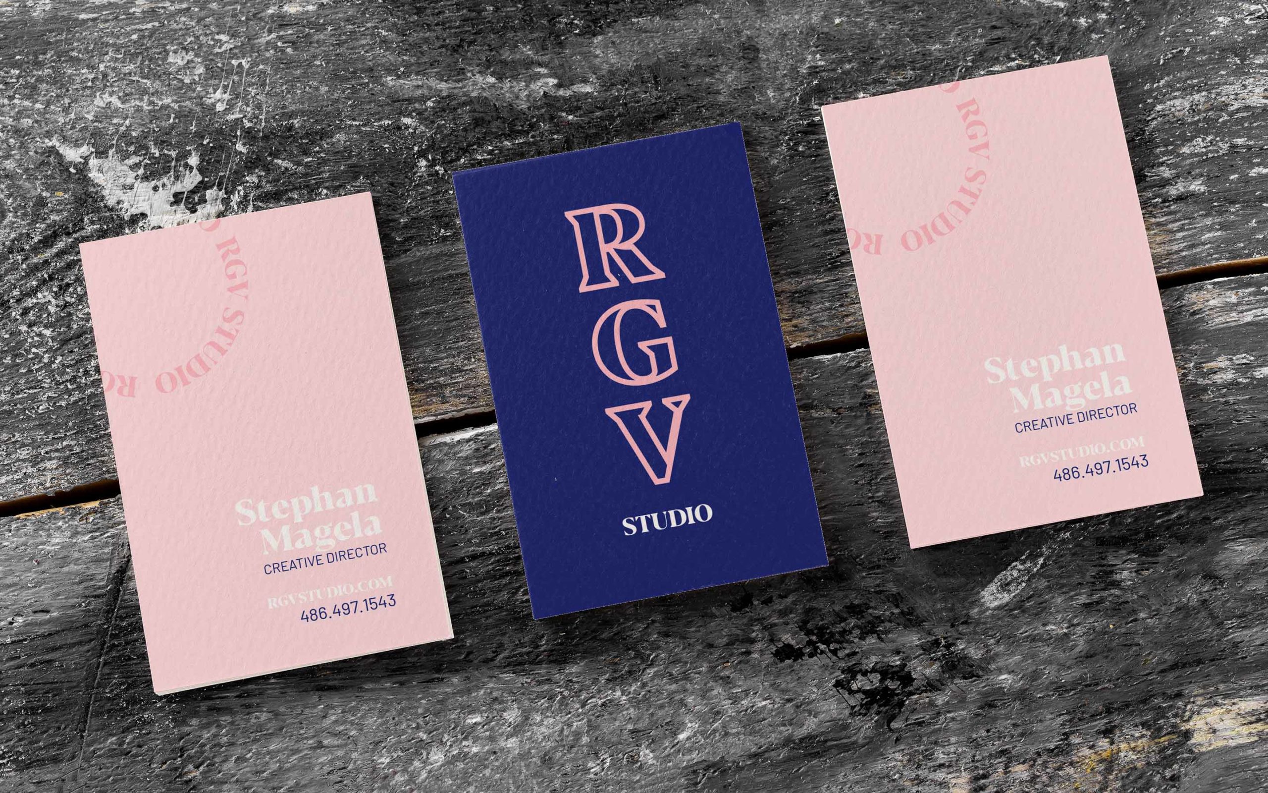
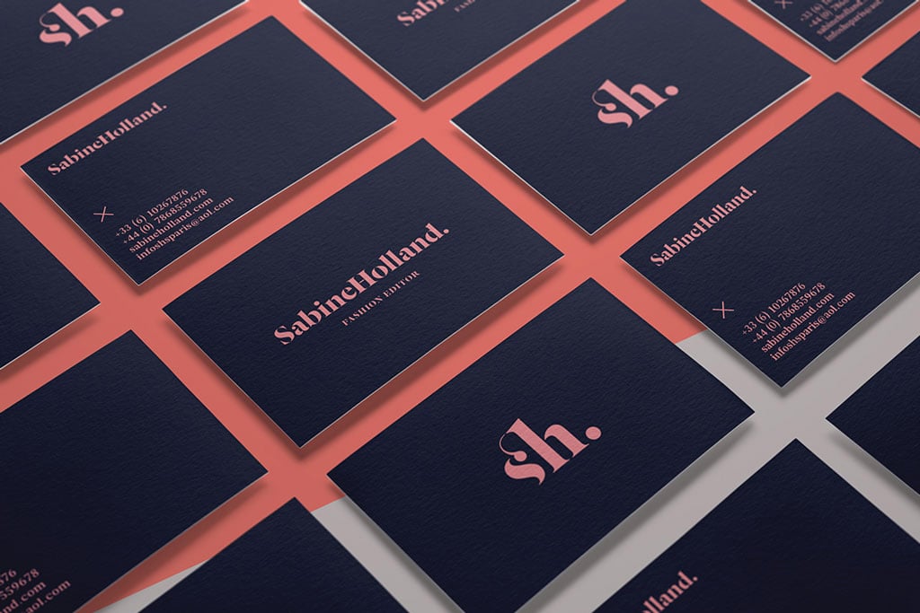
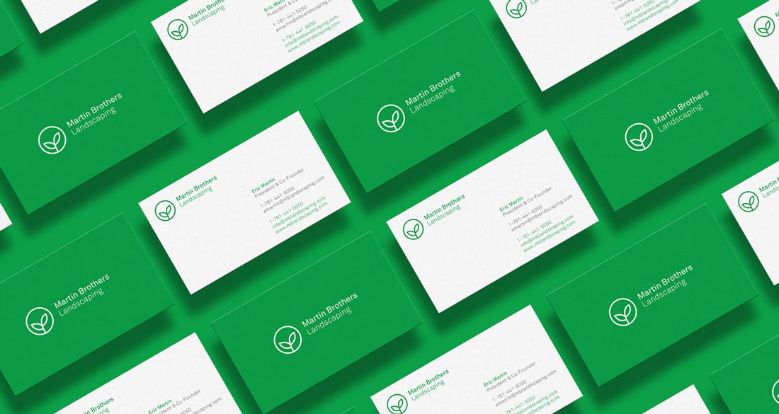
The right font choice can enhance the perception of professionalism and credibility associated with your business. Serif fonts, which feature small decorative lines at the ends of characters, are often considered more formal and traditional, while sans-serif fonts exude a modern and clean aesthetic. Choosing a font that aligns with your industry and target audience can help convey the desired level of professionalism.
Factors to Consider When Choosing a Font
1. Brand Personality
Consider your brand’s personality and the message you want to portray. Are you aiming for a traditional and elegant feel or a modern and innovative vibe? Your font selection should align with these characteristics to create a cohesive and authentic representation of your brand.
2. Target Audience
Understanding your target audience is crucial when selecting a font. Different demographics may have different preferences and respond differently to various styles. For example, a more mature audience may appreciate a classic serif font, while a younger demographic might resonate better with a trendy and contemporary font.
3. Readability
Ensure that the font you choose is easy to read, even at smaller sizes. Consider factors such as spacing between letters (kerning), letter shapes, and overall legibility. Remember that a font that looks great on a computer screen may not necessarily maintain clarity when printed on a small business card.
4. Branding Guidelines
If your business already has established branding guidelines, it is important to consider whether these guidelines include specific font recommendations. Sticking to the designated fonts ensures consistency and prevents any confusion when it comes to representing your brand across various marketing channels.
Popular Font Choices for Business Cards
Now that we understand the significance of selecting the right font for your business cards, let’s explore some popular font choices that can make your card look polished and professional:
1. Helvetica or Arial
Helvetica and Arial are both versatile sans-serif fonts that offer excellent readability. These fonts are widely recognized and used in various industries due to their clean and timeless appeal. They work well for both printed and digital materials and are particularly popular among technology and design-related businesses.
2. Garamond
Garamond is a classic and elegant serif font that exudes sophistication. It has a rich history and is often associated with high-end brands and formal communication. Garamond offers a sense of tradition and authority, making it suitable for industries such as law, finance, or luxury goods.
3. Futura
Futura is a geometric sans-serif font known for its modern and minimalist design. It conveys a sense of forward-thinking and innovation, making it ideal for businesses in creative industries or those targeting a youthful demographic. Futura’s clean lines and simplicity also make it a great choice for readability on small business cards.
4. Lato
Lato is a contemporary sans-serif font that strikes a balance between professionalism and friendliness. With its rounded edges and open letterforms, Lato offers a warm and approachable feel. This font works well for businesses in fields such as consulting, marketing, or education.
5. Baskerville
Baskerville is another timeless serif font that evokes a sense of elegance and refinement. Its calligraphic qualities make it an excellent choice for industries such as design, fashion, or hospitality. Baskerville provides a touch of sophistication and luxury, making your business card stand out.
Conclusion
In summary, selecting the right font for your business cards is a crucial step in creating a professional and visually appealing representation of your brand. The font choice should align with your brand’s personality, target audience, and industry, while also ensuring readability and clarity. Remember to maintain consistency with your overall branding guidelines to establish a strong visual identity. Whether you opt for a classic serif or a modern sans-serif font, make sure your choice reflects your brand’s values and helps you leave a lasting impression on recipients.
Choose your font wisely and elevate the impact of your business cards!
Sophia is a branding expert who intertwines style and substance in her writing. Her marketing background and love for fashion contribute to her unique take on business card design. When not writing, Sophia explores her creative side through painting and DIY projects.