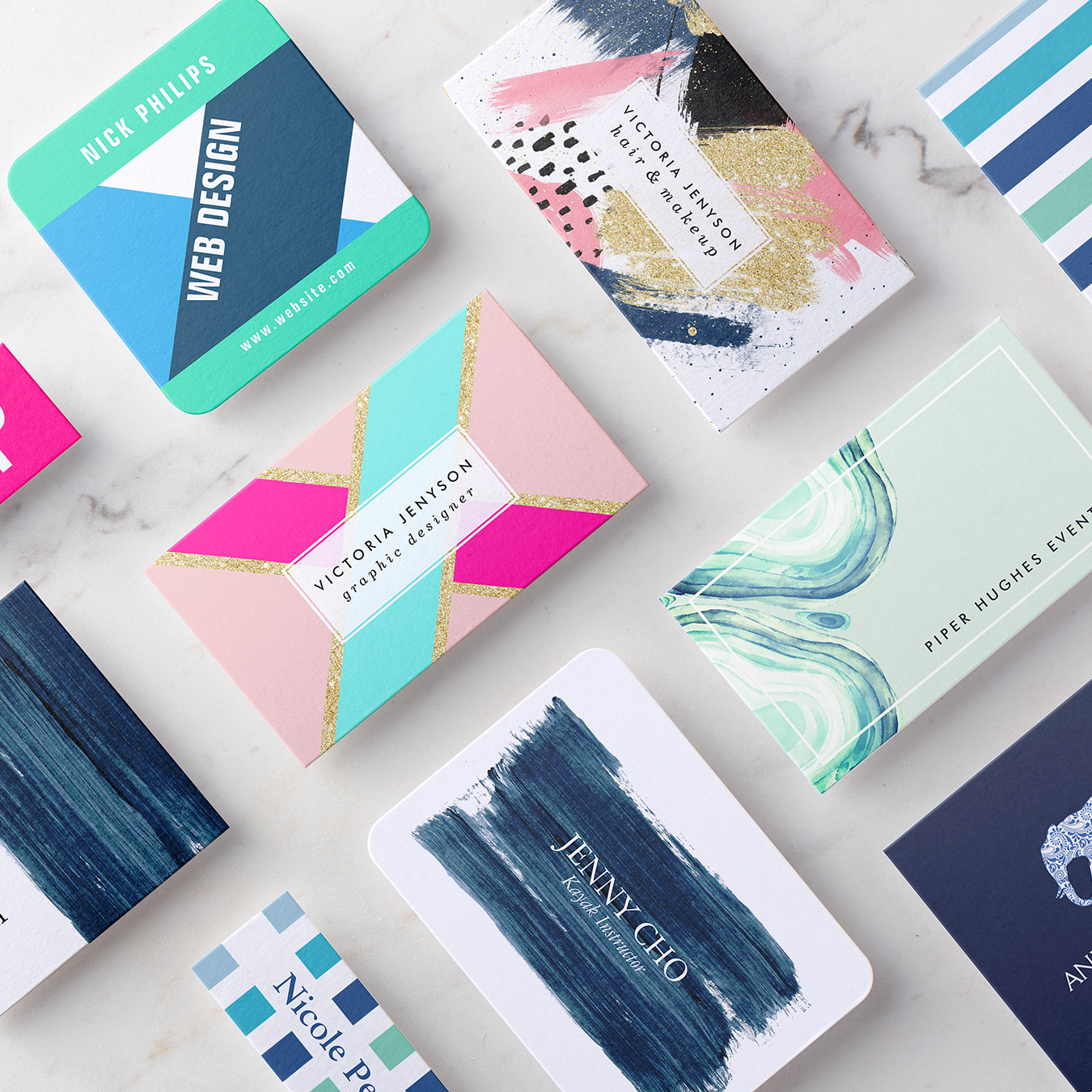
When it comes to business cards, the design is crucial as it reflects your brand and helps create that all-important first impression. While the overall layout, fonts, and imagery are important considerations, the choice of colors can significantly impact how your business card is perceived. Colors have a powerful psychological influence, evoking emotions and associations that can shape how people perceive your business. In this article, we will explore the significance of colors for business cards and provide some tips on how to choose the perfect color palette to make a lasting impact.
Understanding the Psychology of Colors

The Power of Blue
Blue is often associated with trust, reliability, and professionalism. This makes it a popular choice for business cards in industries such as finance, law, and technology. Darker shades of blue, like navy or royal blue, convey a sense of authority and stability. Lighter shades, such as sky blue, can create a more approachable and friendly image. Consider your target audience and the message you want to convey when opting for different shades of blue.
The Energy of Red
Red is a vibrant and attention-grabbing color that symbolizes energy, passion, and urgency. It is often used to draw attention to important information or to make a bold statement. If your industry involves creativity, such as marketing or entertainment, leveraging shades of red could be a great choice for your business card. However, use it sparingly, as an overwhelming amount can create a sense of aggression or intensity.
The Freshness of Green
Green is associated with nature, growth, and freshness. It represents harmony and is often used by businesses related to health, wellness, and sustainability. Different shades of green can evoke different emotions. Lighter greens can represent tranquility and serenity, while darker greens can imply wealth and expertise. If your business aligns with these themes, incorporating green into your business card can help convey your values to potential clients.
The Optimism of Yellow
Yellow is a cheerful and optimistic color that symbolizes happiness, creativity, and intellect. It is often associated with industries such as art, design, and consulting. Yellow can be a powerful attention-grabbing color, but it should be used sparingly to avoid overwhelming the recipient. Consider using yellow as an accent color or combining it with other colors to create a visually appealing contrast.
The Sophistication of Black and White
Black and white are classic choices for business cards. While they may seem simple, they convey sophistication and elegance. Black represents authority and power, while white represents purity and simplicity. Combining black and white can create a timeless and professional look for your business card. Adding a pop of color to a black and white design can draw attention to key elements and make your card visually striking.
Tips for Choosing Your Color Palette

While understanding the psychology behind colors is important, it is crucial to consider how these colors will align with your brand and resonate with your target audience. Here are some tips to help you choose the perfect color palette for your business card:
1. Research Your Industry
Researching the dominant color schemes in your industry can provide valuable insight. Look at successful businesses in your field and analyze their choice of colors. This can give you a starting point and help you understand the expectations of your target audience.
2. Consistency with Branding
Your business card is a representation of your brand identity. Ensure that the colors you choose align with your overall branding strategy, including your logo, website, and other marketing materials. Consistency in colors will help create a cohesive and memorable brand image.
3. Consider Target Audience
Different colors resonate differently with various demographics. Consider your target audience’s age, culture, and preferences when selecting your color palette. For example, younger audiences may respond well to vibrant and bold colors, while older audiences may prefer more traditional and subdued tones.
4. Balance and Contrast
When choosing colors for your business card, it is important to create a balance and contrast that is visually appealing. Ensure that your text and important information stand out against the chosen colors. A good rule of thumb is to pair light backgrounds with dark text and vice versa to achieve readability.
5. Test with Focus Groups
If you are unsure about the effectiveness of your chosen color palette, consider conducting focus groups. Collect feedback from your target audience to gauge their perceptions and preferences. This can provide valuable insights and help you refine your color choices to maximize impact.
Conclusion
When it comes to business cards, color plays a significant role in creating a lasting impression and conveying your brand’s personality. Understanding the psychology of colors and how they resonate with your target audience is vital for making informed design choices. Consider the traits and emotions associated with each color when selecting your color palette. By choosing the right colors, you can create a visually appealing and memorable business card that stands out from the competition and leaves a positive and lasting impact on potential clients.
Remember, the choice of colors for your business card should always be a deliberate and thoughtful decision, ensuring that it accurately reflects your brand identity and resonates with your target audience. So take your time, experiment, and choose wisely to create a business card that truly represents your business in the best possible way.
Samuel Anderson, a branding connoisseur, brings his knack for design and a strong marketing background to the forefront. He’s a voracious reader and enjoys delving into psychology, which he incorporates into his marketing strategies for business cards and brand development.