Are you looking for a way to make your business cards stand out and leave a lasting impression on potential clients? Look no further than business cards with raised lettering. This classic and sophisticated technique adds a touch of elegance and professionalism to any business card design. In this article, we will explore the benefits and design options of business cards with raised lettering, as well as how they can enhance your overall brand image.
The Benefits of Raised Lettering
Business cards with raised lettering offer several advantages over their flat-printed counterparts. Here are a few key benefits:
- Tactile Experience: Raised lettering provides an interactive and tactile experience, making your business card memorable and attention-grabbing. By adding a three-dimensional element to your card, you create a unique texture that engages the senses and sets your brand apart.
- Enhanced Visual Appeal: Raised lettering adds depth and dimension to your business card design. It creates a sense of luxury and sophistication, instantly elevating the perceived value of your brand. Whether it’s a logo, company name, or contact information, raised lettering makes the design visually striking and captivating.
- Durability: Raised lettering is more durable compared to regular printed text. The embossed letters have a slightly higher elevation and are less prone to wear and tear. This ensures that your business cards maintain their professional appearance even after being handled multiple times.
- Professionalism: The use of raised lettering conveys professionalism and attention to detail. It shows that you have taken the time and effort to invest in high-quality materials and elegant design techniques. This sends a positive message about your commitment to excellence and your overall brand values.
Design Options for Raised Lettering
When considering business cards with raised lettering, you have various design options to choose from. Here are a few popular choices:
1. Font Styles and Sizes
Selecting the right font style and size is crucial for creating an attractive and readable design. A classic serif font, such as Times New Roman or Garamond, can add a touch of sophistication. Alternatively, a sleek and modern sans-serif font, such as Helvetica or Futura, can convey a contemporary and professional feel. Experiment with different sizes to ensure legibility and balance with the rest of the design elements.
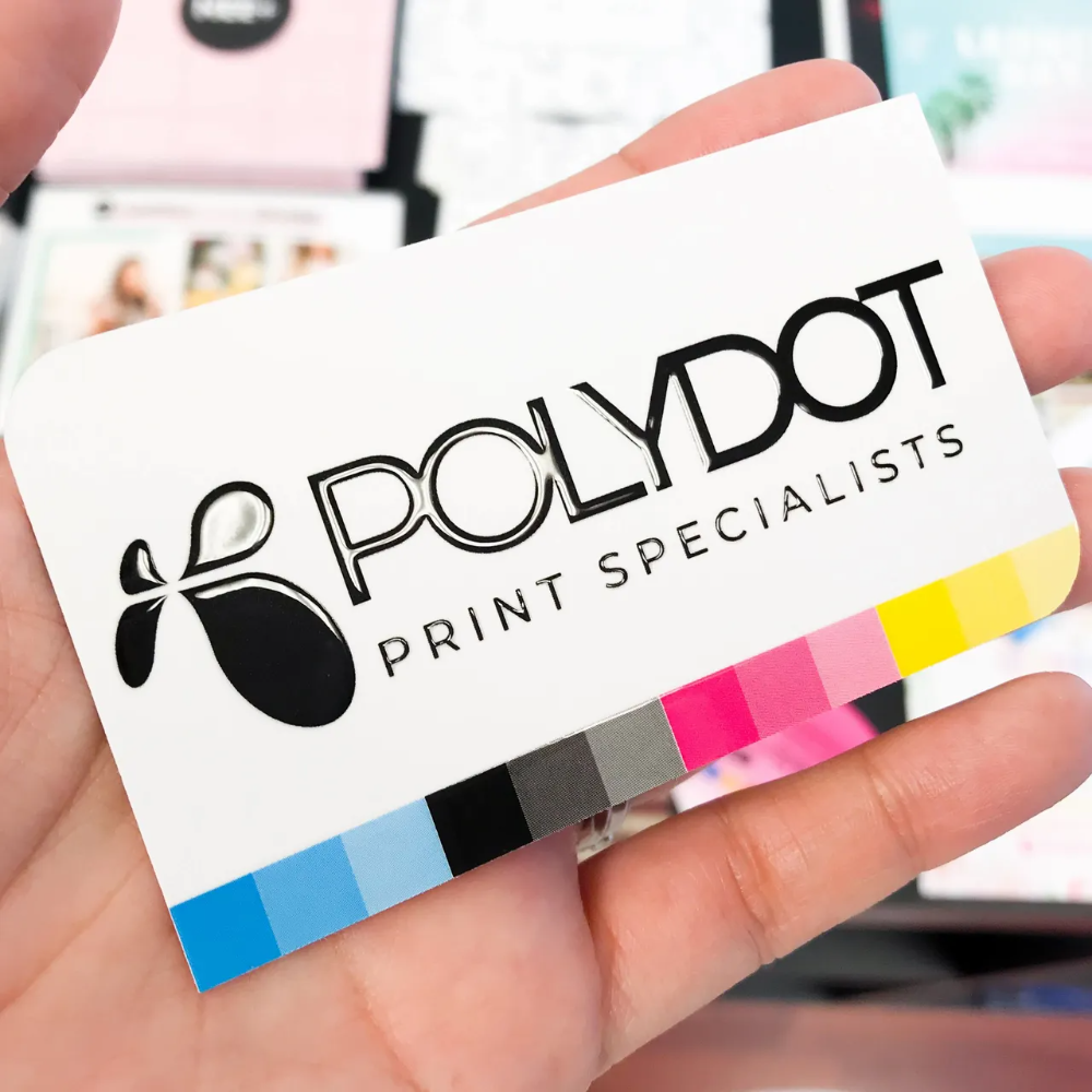
2. Color Contrast
Consider the color contrast between the raised lettering and the background of your business card. Optimal contrast ensures that the raised text is easily visible and stands out from the rest of the design. For example, if your card background is dark, choose a lighter color for the raised lettering to create a striking visual impact.
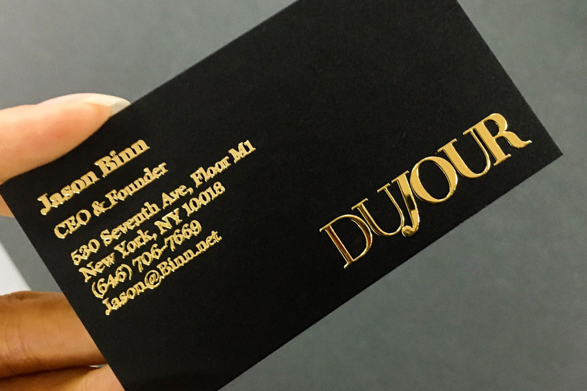
3. Embossed or Debossed Effect
With raised lettering, you have the option to choose from embossed or debossed effects. Embossing raises the letters above the surface of the card, creating a 3D effect. On the other hand, debossing presses the letters into the card, creating a sunken or engraved appearance. Both techniques add depth and texture, giving your business cards a premium look and feel.
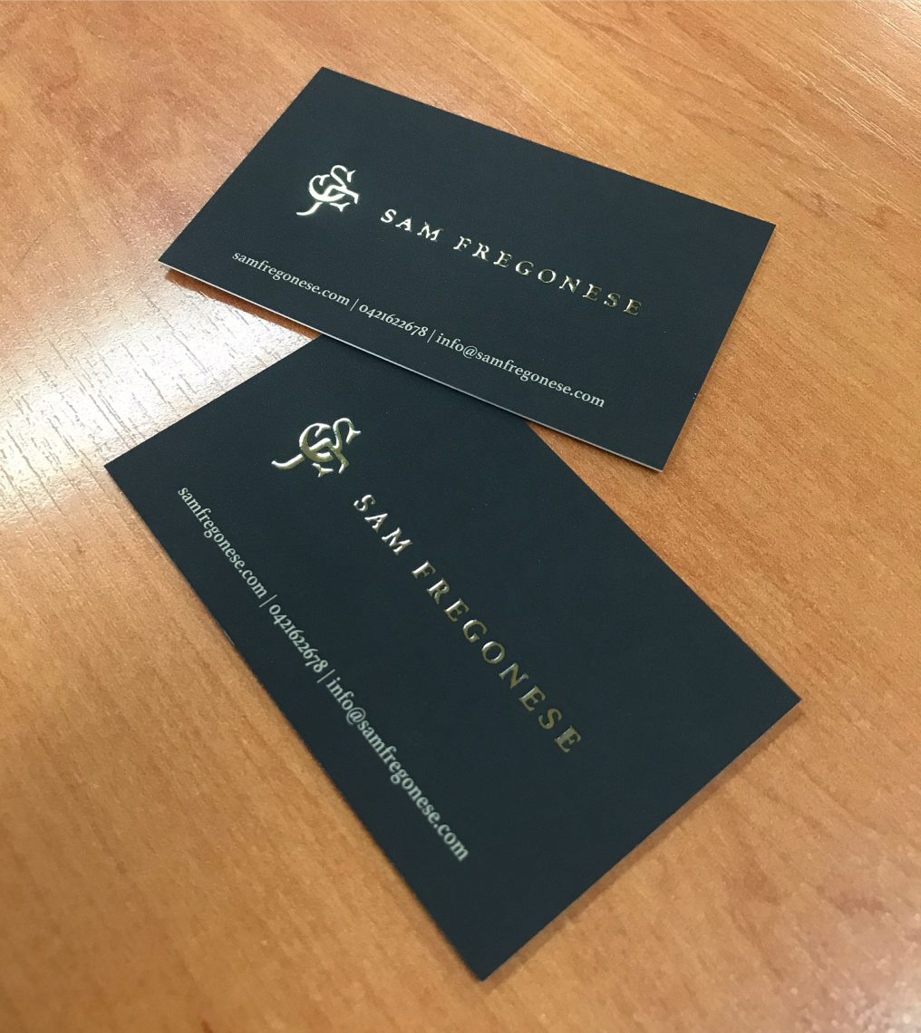
4. Combination with Foil Stamping
For an even more luxurious and eye-catching design, consider combining raised lettering with foil stamping. Foil stamping adds metallic accents to your card, such as gold, silver, or copper, and can be applied to the raised lettering as well. This combination creates a sophisticated contrast between the matte background and the shiny metallic details, further enhancing the visual appeal of your business cards.
How Raised Lettering Enhances Your Brand Image
Business cards with raised lettering can greatly enhance your brand image and leave a memorable impression on recipients. Here’s how:
- Brand Identity: Raised lettering adds a touch of elegance and sophistication that aligns with a premium brand identity. By investing in this technique, you show that your brand values quality, attention to detail, and professionalism.
- Improved Recognition: The unique texture and visual appeal of raised lettering make your business cards distinct and recognizable. People are more likely to remember and recognize your brand when presented with an eye-catching design. This can lead to increased brand visibility and recall.
- Perceived Value: Raised lettering adds a perceived value to your business cards. When recipients hold a card with raised text, they immediately associate your brand with quality and prestige. This can positively influence their perception of your products or services and increase the likelihood of future engagements.
- Impression of Competence: A well-designed business card with raised lettering reflects attention to detail and professionalism. It creates a positive first impression, suggesting that you are competent and reliable in your field. This can be particularly important when networking or meeting potential clients for the first time.
Conclusion
Embracing the timeless elegance of business cards with raised lettering is a powerful way to elevate your brand image. The tactile experience, enhanced visual appeal, and professionalism associated with raised lettering make it an excellent choice for any business seeking to leave a lasting impression. Whether you opt for embossing, debossing, or a combination with foil stamping, these design options allow you to customize your business cards to align with your brand identity. So, go ahead and invest in the artistry of raised lettering to make your business cards truly exceptional and unforgettable.
William’s writing reflects a deep passion for graphic design and marketing. With a background in the visual arts, he adds a unique perspective to his content. In his spare time, William enjoys visiting art galleries and seeking out the latest design trends.