
When it comes to designing your business cards, choosing the right font is crucial. The typeface you select can greatly impact how your card is perceived and remembered by potential clients and business partners. In this article, we will explore the importance of fonts in business card design and provide tips on selecting the perfect typography to make a lasting impression.
The Impact of Fonts on Business Card Design
Typography plays a significant role in visual communication and can convey different emotions, attitudes, and brand personalities. The font you choose for your business cards should align with your brand identity and reflect the nature of your business. It should be legible and visually appealing, grabbing attention without overpowering the overall design.
Legibility: The Key to Effective Communication
The primary purpose of a business card is to provide contact information. Therefore, it is essential to choose a font that is highly legible. Ensure that the letters are clear and distinct, even at small sizes. Ornate or overly decorative fonts may look artistic, but if they hinder readability, they are not suitable for business cards.
Reflecting Your Brand Identity
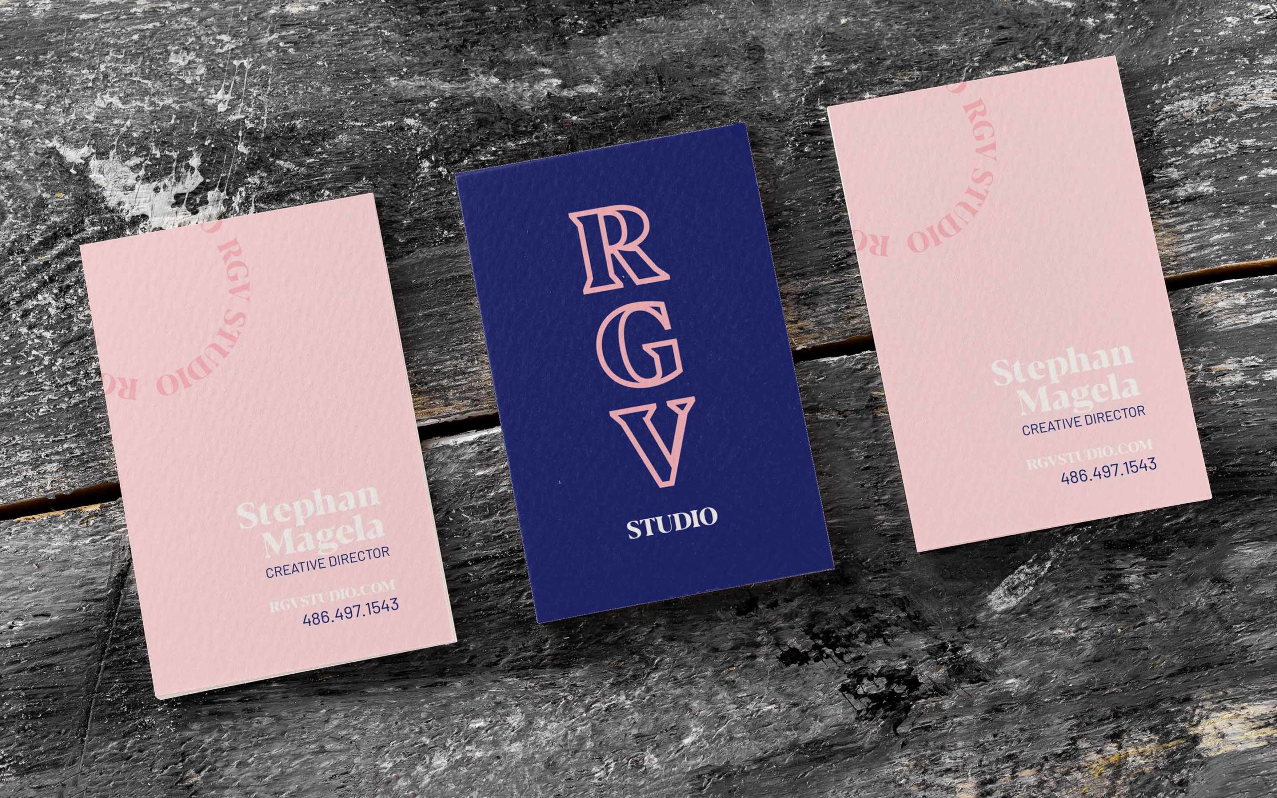
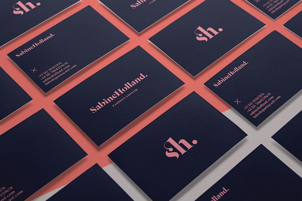
Consider the personality of your brand and the image you want to portray. Are you a formal and professional business, or do you have a more casual and creative vibe? Different fonts evoke various feelings and impressions. Serif fonts such as Times New Roman or Georgia often convey a classic, traditional, or conservative image, while sans-serif fonts like Arial or Helvetica tend to project a more modern and streamlined look.
Establishing Consistency Across Marketing Materials
Using consistent typography across all of your marketing materials, including business cards, helps establish a strong and cohesive brand identity. Selecting a font that can be easily incorporated into other collateral, such as your website, brochures, or social media graphics, ensures visual harmony and brand recognition.
Tips for Choosing the Right Business Card Fonts
Now that we understand the importance of fonts in business card design, let’s explore some tips to help you choose the perfect typography for your cards.
1. Consider Readability
As mentioned earlier, legibility is key. Opt for fonts that are clear, with well-defined letterforms. Avoid overly fancy or script-like fonts that may be difficult to read, especially at smaller sizes. For optimal readability, it is generally recommended to use font sizes between 8 to 12 points.
2. Strike the Right Balance
Finding a balance between standing out and fitting in is crucial. While you want your business cards to be distinctive, using a font that is too unique or unconventional may make it difficult for recipients to take your card seriously. Aim for a font that is eye-catching but still maintains professionalism.
3. Think about Compatibility
Consider the compatibility of the font across various platforms and devices. Not all computers or printers may have certain fonts installed, which could result in a mismatched appearance or substitutions with default options. To ensure consistent rendering, choose widely available fonts or provide font files with your design when necessary.
4. Experiment with Typography Hierarchy
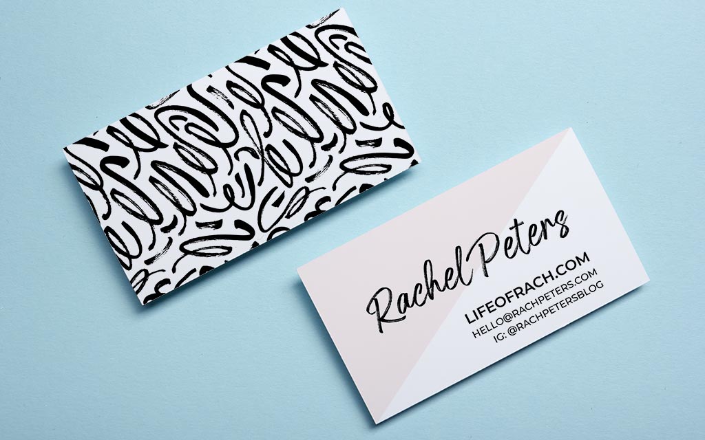
Typography hierarchy refers to the visual arrangement of different text elements on your business card. Experiment with font styles, sizes, and weights to create visual interest and guide the reader’s attention. Use a bold or italic font for your name or business name, and a lighter weight for secondary information such as contact details or job titles.
5. Don’t Overdo It with Font Variations
While using different font variations can add visual interest, it’s important not to go overboard. Limit yourself to two or three different fonts to maintain a cohesive and harmonious design. Mixing too many fonts can create a chaotic appearance and dilute your overall message.
6. Test for Accessibility
Ensure that the font you choose complies with accessibility guidelines, particularly if your business has a legal obligation to accommodate individuals with visual impairments. Select a font that offers good contrast with the background and choose font sizes and line spacing that make your business card accessible for all.
Popular Fonts for Business Cards
Now that you are armed with valuable tips on selecting the right fonts, let’s explore some popular font choices for business cards:
1. Helvetica
Helvetica is a versatile sans-serif font known for its clean and modern appearance. Its simplicity and readability make it a popular choice across various industries.
2. Futura
Futura is an elegant sans-serif font that exudes a sense of sophistication and modernity. Its geometric shapes and harmonious proportions make it suitable for stylish and upscale businesses.
3. Garamond
Garamond is a classic serif font with a timeless appeal. Its elegant and traditional look is often associated with high-end brands and professional services.
4. Montserrat
Montserrat is a contemporary sans-serif font that combines functionality with a sleek and modern aesthetic. Its versatility makes it suitable for a wide range of businesses, from tech startups to creative agencies.
5. Baskerville
Baskerville is a serif font that brings a touch of old-world charm to your business cards. Its distinctive and elegant look complements traditional and luxurious brands.
Conclusion
In the world of business cards, fonts matter. They play a crucial role in establishing brand identity, ensuring readability, and leaving a lasting impression on potential clients and business associates. By considering factors such as legibility, brand alignment, and consistency, you can confidently choose the perfect typography for your business cards. Remember, the right font can elevate your design and make your business cards truly unforgettable.
Ethan is a branding enthusiast and a master of storytelling. With a background in advertising, he leverages his expertise to explore the art of graphic design and its impact on business. In his free time, Ethan enjoys photography and capturing the world’s visual intricacies.