
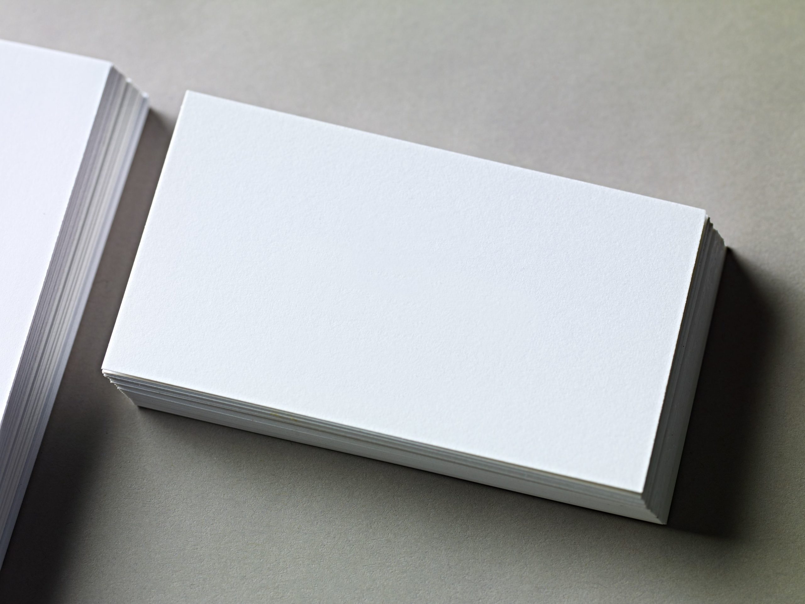
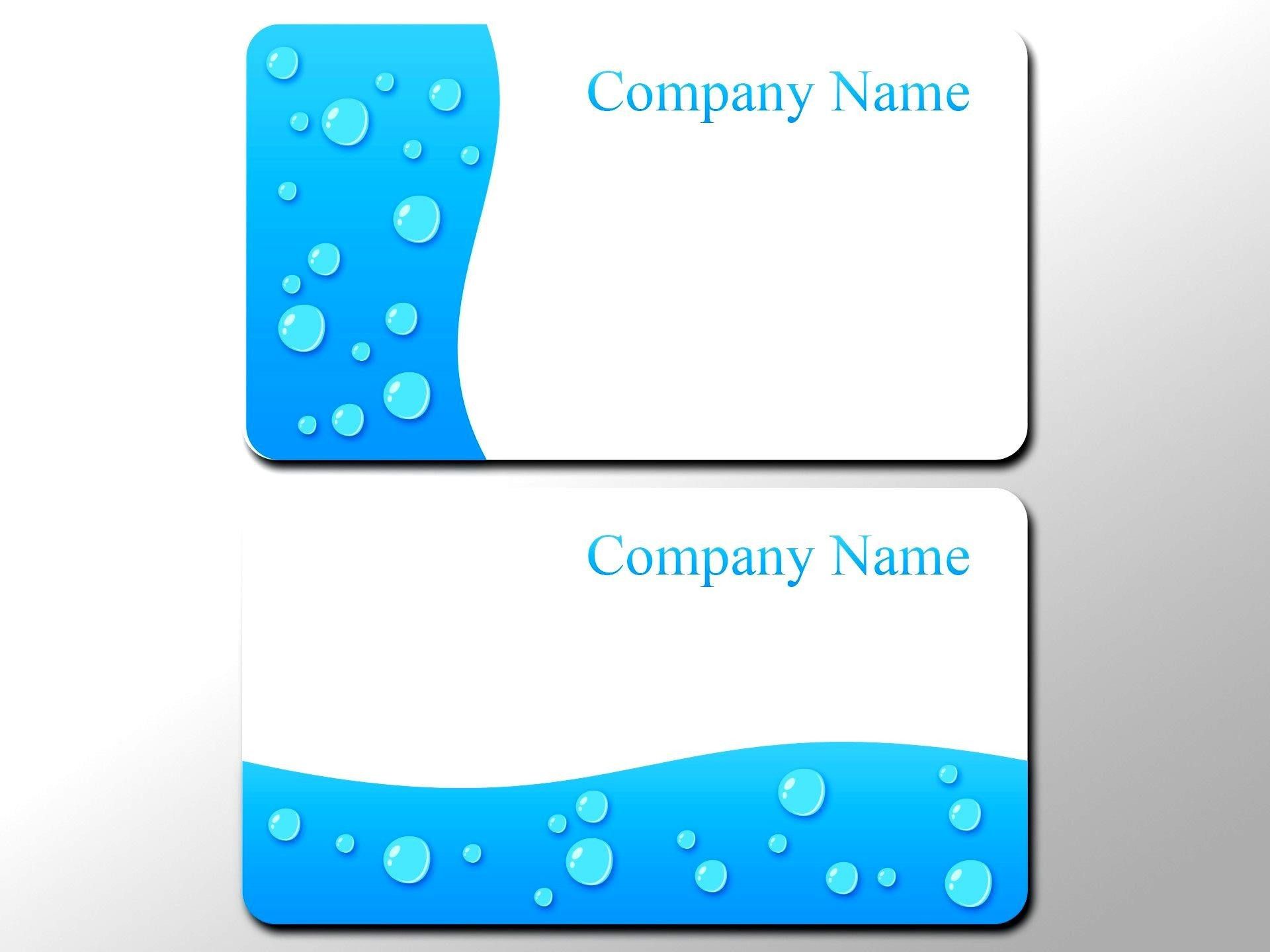
Are you looking to make a lasting impression with your business cards? Do you want them to represent your brand in a visually appealing way? Look no further than blank coloured business cards. These unique cards allow you to create a design that truly reflects your brand’s personality and style. In this article, we will explore the benefits of using blank coloured business cards, how to choose the right colours for your brand, and provide some design tips to help you create an eye-catching and professional-looking card.
Benefits of Blank Coloured Business Cards
1. Uniqueness and Memorability: One of the main advantages of using blank coloured business cards is that they stand out from the crowd. While traditional business cards often blend in with the rest, blank coloured cards catch people’s attention and make a memorable impact. When you hand out a vibrant card, it creates a lasting first impression and makes people more likely to remember you and your brand.
2. Reflects Brand Personality: The colours you choose for your business cards can say a lot about your brand’s personality and values. Blank coloured business cards offer you the flexibility to select hues that align with your brand identity. For example, a technology company might opt for sleek and modern colours, while a creative agency may choose bold and vibrant shades. With blank coloured business cards, you have complete control over the design and can reflect your brand’s unique character.
3. Versatility: Blank coloured business cards are highly versatile. Whether you are an entrepreneur, freelancer, or part of a large organization, these cards provide a canvas to showcase your creativity. You can experiment with different colours, fonts, and layouts to create a design that best represents your business. The versatility of blank coloured cards allows you to adapt your design as your brand evolves, ensuring that your cards always stay fresh and relevant.
4. Enhanced Visual Appeal: Choosing the right colours for your business cards is crucial to creating an aesthetically pleasing design. Blank coloured cards add a pop of colour and visual interest that can set you apart from competitors. Moreover, strategic use of colours can evoke emotions and convey messages about your brand. For example, warm tones like red and orange can evoke a sense of energy and passion, while cooler hues like blue and green can evoke a feeling of calm and trust. By carefully selecting the right colours, you can create a visually appealing card that captivates your audience.
Choosing the Right Colours for Your Blank Coloured Business Cards

When selecting colours for your blank coloured business cards, it is essential to consider your brand identity, target audience, and the message you want to convey. Here are some tips to help you make the right choice:
1. Research Colour Psychology: Colour psychology plays a significant role in influencing how people perceive your brand. Different colours evoke different emotions and convey various messages. For instance, blue is often associated with trust and professionalism, while yellow signifies energy and positivity. Research the meanings and associations of different colours to ensure your selection aligns with your brand values.
2. Consider your Brand Personality: Your brand’s personality should guide your colour choices. If your brand is fun-loving and vibrant, you may want to consider using bright and bold colours. On the other hand, if your brand is more sophisticated and professional, opting for neutral or muted tones could be more appropriate. Make sure the colours you choose resonate with your brand’s identity and values.
3. Contrast for Readability: While it is important to choose visually appealing colours for your business cards, readability should not be compromised. Ensure that the colours you select for your text and background have enough contrast to make the information easily readable. For example, using a light-colored font on a light background could make it difficult for recipients to read your contact information.
4. Colour Combinations: Selecting complementary or analogous colours can create a visually pleasing and harmonious design. Complementary colours are opposite each other on the color wheel, such as blue and orange or red and green. Analogous colours, on the other hand, are adjacent to each other, like blue and purple or red and orange. Experiment with different colour combinations to find the ones that best represent your brand and create a visually appealing card.
Design Tips for Eye-catching Blank Coloured Business Cards
Now that you have chosen the right colours for your blank coloured business cards, it’s time to design them in a way that captures attention and leaves a lasting impact. Here are some design tips to help you create eye-catching cards:
1. Minimalism with a Splash of Colour: Consider using a clean and minimalistic design with a bold splash of colour. This approach allows your brand’s information and logo to be the focal point, while the vibrant colour adds visual interest and makes the card memorable. A business card with a clear and uncluttered design can also convey professionalism and elegance.
2. Strategic Use of White Space: White space, also known as negative space, refers to the empty areas on your business cards. Strategic use of white space can enhance the overall visual appeal of your design, making it easier for recipients to focus on the important details. Don’t be afraid to keep some areas of your card blank, as this can create a sense of balance and elegance.
3. Incorporate Texture and Patterns: Adding texture or patterns to your blank coloured business cards can make them more visually engaging. Consider using metallic finishes, embossing, or spot UV coating to add a tactile element that elevates your design. Incorporating patterns, such as stripes or polka dots, can also add personality and make your cards stand out even more.
4. Experiment with Typography: Typography plays a crucial role in conveying your brand’s personality and creating visual interest. Experiment with different fonts, sizes, and styles to find a combination that aligns with your brand and enhances readability. Mixing a bold and eye-catching font for your logo with a more simple and legible font for the contact information can create a visually appealing hierarchy.
Conclusion
Blank coloured business cards offer a unique opportunity to make a lasting impression by using vibrant and eye-catching designs. By carefully selecting colours that align with your brand’s personality and values, you can create cards that stand out from the rest while reflecting your professionalism. Remember to consider colour psychology, contrast for readability, and explore different colour combinations to find the perfect fit for your brand. By incorporating design principles such as minimalism, strategic use of white space, and experimenting with typography, you can create visually stunning blank coloured business cards that leave a lasting impact on your recipients. So why wait? Start designing your blank coloured business cards today and make a statement that resonates with your audience.
Ava Taylor’s passion for branding and marketing shines through in her dynamic writing. She brings a unique perspective with her background in event planning, infusing creativity into her content. When she’s not writing, Ava enjoys organizing community events and gatherings.