
When it comes to designing a business card, every detail matters. From the color scheme to the layout, every element should be carefully considered to create a professional and memorable representation of your brand. One crucial aspect of business card design is the font size. Selecting the right font size is essential for readability and visual appeal. In this article, we will explore the best font size for business cards and provide you with some helpful tips to make your business card stand out.
Factors to Consider When Choosing Font Size
Before we delve into the specifics of the best font size for business cards, let’s first understand the factors you need to consider when making this decision. Here are a few important points to keep in mind:
1. Legibility
Legibility should be your top priority when selecting a font size for your business card. You want your contact information, including your name, phone number, and email address, to be easily readable at a quick glance. Remember, your business card is essentially your mini billboard, and if the font size is too small, potential clients may struggle to read your information.
2. Card Size
Consider the size of your business card when deciding on the font size. Smaller business cards may require a slightly larger font size to maintain legibility, whereas larger cards can accommodate slightly smaller font sizes without compromising readability.
3. Font Style
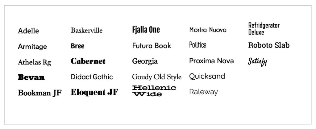
Different font styles have different proportions and varying levels of readability at different sizes. Some fonts may appear smaller or larger even with the same font size. It’s important to select a font style that is easy to read and enhances the overall aesthetic of your business card.
4. Hierarchy of Information
Take into account the hierarchy of information on your business card. Your name, job title, and company name are typically the most important details and should be more prominent than secondary information such as your phone number or website. Adjusting the font size accordingly can help emphasize the essential details.
Now that we’ve covered the factors to consider, let’s dive into the recommended font sizes for business cards.
Recommended Font Sizes for Business Cards

1. Main Text
The main text on your business card, which includes your name, job title, and company name, should be the most prominent and easily readable. A font size ranging from 10 to 12 points is generally considered optimal for this primary information. This size strikes a balance between legibility and conserving space on the card.
2. Secondary Text
Secondary text on your business card, such as your phone number, email address, and website, can be slightly smaller to fit the overall design. A font size between 8 and 10 points is often suitable for these details. However, ensure that the text is still legible and not too small for individuals with less-than-perfect eyesight.
3. Additional Details
If your business card includes any additional details, such as social media handles, physical address, or slogan, these can be even smaller than the secondary text. A font size between 6 and 8 points is generally acceptable for this type of information. Just be cautious not to go too small to the point where it becomes difficult to read.
Tips to Enhance Readability
While selecting the appropriate font size is crucial, there are a few extra tips you can follow to further enhance the readability of your business card:
1. Use Clear and Legible Fonts
Opt for clear and legible fonts that are easy to read at small sizes. Serif and sans-serif fonts, such as Arial, Helvetica, and Times New Roman, are generally recommended for business cards as they offer good readability even at smaller font sizes.
2. Contrast is Key
Ensure there is enough contrast between the font color and the background color of your business card. A light font on a dark background or a dark font on a light background will make your text stand out and increase legibility.
3. Choose Proper Spacing
Pay attention to the spacing between lines and characters. Sufficient spacing ensures that the text does not appear cramped and facilitates easy reading. Adequate spacing also makes the card look more professional and visually appealing.
4. Test Your Design
Before finalizing your business card design, take the time to print a sample and review it in different lighting conditions. This will help you identify any potential readability issues and make necessary adjustments.
Conclusion

When it comes to business card design, selecting the best font size is vital to convey your contact information effectively. By considering factors such as legibility, card size, font style, and hierarchy of information, you can determine the most appropriate font sizes for different sections of your business card. Remember, the main text should be more prominent while secondary details can be slightly smaller, maintaining readability without compromising the overall aesthetic. By following these guidelines and considering additional tips to enhance readability, you can create a professional and memorable business card that leaves a lasting impression on potential clients.
Sophia is a branding expert who intertwines style and substance in her writing. Her marketing background and love for fashion contribute to her unique take on business card design. When not writing, Sophia explores her creative side through painting and DIY projects.