
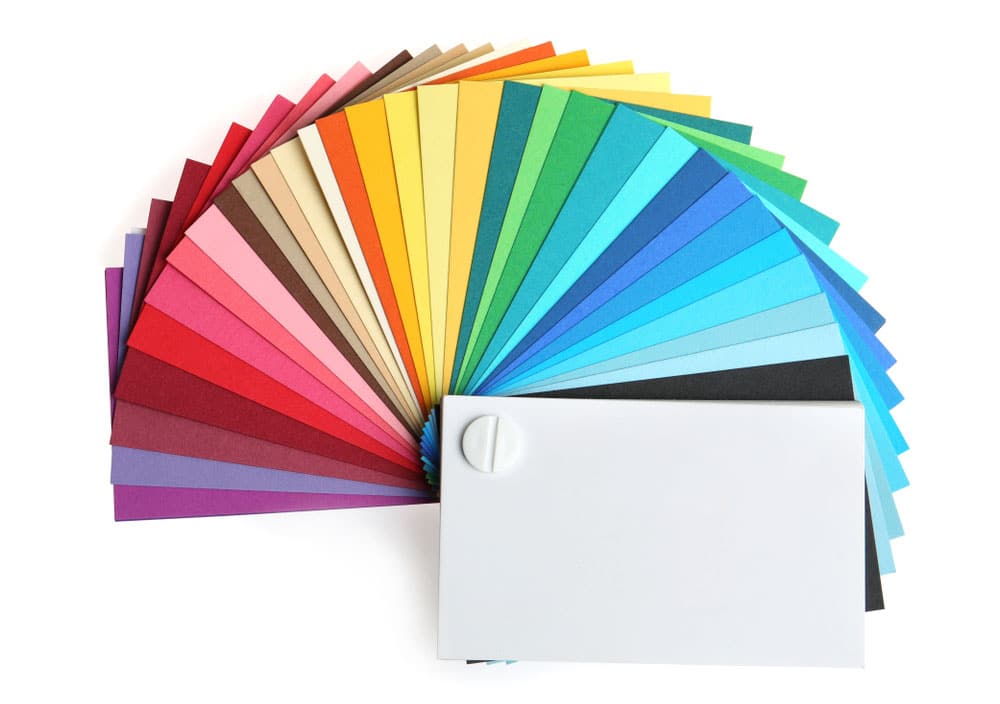
When it comes to designing business cards, choosing the right colors is crucial. Colors play a significant role in shaping perceptions, creating a visual impact, and conveying messages. Whether you’re representing a company or yourself, the colors you choose can greatly influence how people perceive your brand or personal identity.
In this article, we will explore the best colors for business cards and discuss the psychology behind each color. By understanding the impact of different colors, you will be able to make an informed decision that aligns with your brand and helps you stand out from the competition.
The Psychology of Colors
Before we delve into specific color choices for business cards, it’s essential to understand the psychological effects they can have on individuals. Each color evokes certain emotions and associations that can influence how your business card is perceived. Let’s take a closer look at the psychology behind some common colors:
1. Blue: Trust and Professionalism
Blue is a popular color choice for business cards, and for good reason. It is often associated with trust, reliability, and professionalism. Blue is known to evoke feelings of calmness and stability, making it an excellent choice for industries such as finance, law, and technology. Incorporating shades of blue into your business card design can create a sense of credibility and establish a trustworthy image.
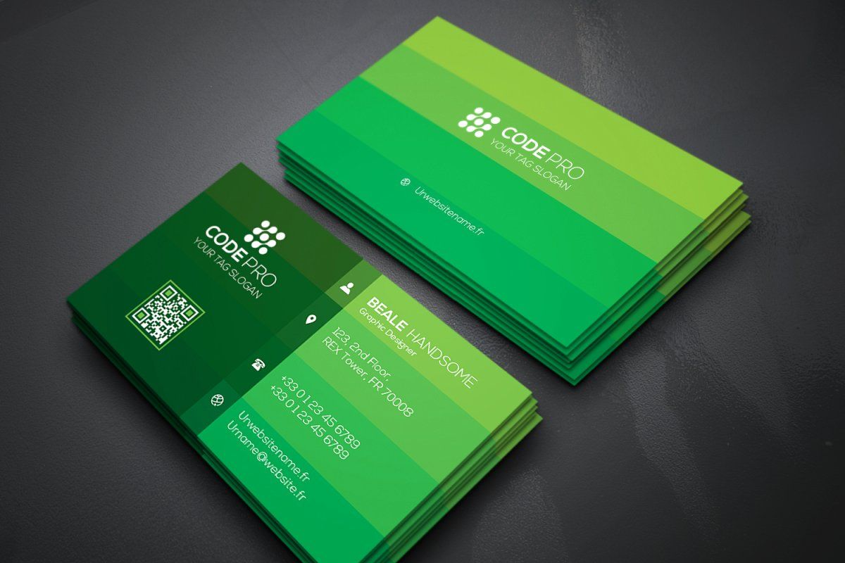
2. Green: Growth and Nature
Green is often associated with growth, freshness, and nature. It symbolizes harmony, balance, and renewal. If your business is related to sustainability, health, or organic products, green can be an ideal color choice for your business card. It can convey a sense of eco-consciousness and create a connection with individuals who share similar values.
3. Red: Energy and Boldness
Red is a powerful and attention-grabbing color. It is often associated with energy, passion, and excitement. Red can be an excellent choice for businesses that want to make a bold statement and stand out from the crowd. However, it is important to use red judiciously, as an excessive amount can be overwhelming. Incorporating red accents into your business card design can inject a sense of dynamism and create a lasting impression.
4. Yellow: Positivity and Creativity
Yellow is a vibrant and cheerful color that evokes feelings of positivity, optimism, and creativity. It can instantly grab attention and create an uplifting mood. However, yellow should be used with caution, as excessive use can strain the eyes or appear too vibrant. When used strategically in combination with other colors, yellow can add a touch of energy and playfulness to your business card.
5. Black: Elegance and Sophistication
Black is a classic color that is often associated with elegance, sophistication, and professionalism. It can create a sense of authority and timelessness. Using black as a primary color for your business card can give it a sleek and modern look. However, it’s important to balance black with other elements to ensure that your design doesn’t come across as too heavy or somber.
6. Purple: Creativity and Luxury
Purple is often associated with creativity, luxury, and royalty. It can convey a sense of uniqueness and originality. If your business falls under the creative or artistic industry, incorporating shades of purple into your business card design can help portray your brand’s imaginative nature. Purple can add an element of sophistication while still being visually appealing.
7. Orange: Enthusiasm and Warmth
Orange is a color that exudes enthusiasm, warmth, and energy. It is often associated with friendliness and approachability. If your business aims to create a friendly and welcoming image, using orange in your business card design can help achieve that. However, it’s crucial to balance orange with other colors to avoid overwhelming the recipient.
Combining Colors for an Impactful Design
Now that we have explored the psychology behind different colors, it’s important to understand how to combine them effectively for an impactful business card design. Here are a few tips to help you create a visually appealing and cohesive card:
- Contrasting Colors: When selecting colors, consider pairing contrasting colors to create a visually striking effect. For example, pairing blue and orange can create a complementary contrast that grabs attention.
- Color Hierarchy: Establish a color hierarchy to guide the viewer’s eye. Use bold colors for important elements such as the company name or headline, and use more subdued colors for supporting text or contact information.
- Minimalism: Opt for a more minimalist approach by using one or two primary colors. This can create a clean and modern look, allowing the recipient to focus on the essential information.
- Color Schemes: Consider using established color schemes like monochromatic, analogous, or complementary. These schemes ensure that the colors work harmoniously together, creating a cohesive design.
- Consistency: Ensure that the colors you choose align with your brand identity and are consistent across all marketing materials. Consistency in color usage helps build recognition and strengthens your brand image.
Conclusion
When designing business cards, choosing the right colors is crucial for creating a lasting impression. Each color evokes different emotions and associations, making it essential to understand the psychology behind them. Blue conveys trust and professionalism, green symbolizes growth and nature, red represents energy and boldness, yellow exudes positivity and creativity, black portrays elegance and sophistication, purple signifies creativity and luxury, and orange reflects enthusiasm and warmth.
By carefully selecting and combining colors, you can create a business card design that aligns with your brand identity, grabs attention, and leaves a lasting impression on recipients. Remember to consider the industry you’re in and the message you want to convey, and always strive for a visually appealing and cohesive design. So, get creative with your color choices and design a business card that truly stands out and makes an impact.
With the right colors and a well-thought-out design, your business card can become a powerful tool for representing your brand and leaving a lasting impression on potential clients and partners.
Sophia is a branding expert who intertwines style and substance in her writing. Her marketing background and love for fashion contribute to her unique take on business card design. When not writing, Sophia explores her creative side through painting and DIY projects.