
Are you looking to make a positive impression with your business card? Want your card to stand out from the competition and reflect the aesthetics of your brand? In today’s competitive business world, having a unique and visually appealing business card can make all the difference. Aesthetics business cards are a great way to showcase your personality and leave a lasting impression on potential clients and customers. In this article, we will explore the importance of aesthetics in business cards and provide tips on creating cards that are not only visually pleasing but also effective in conveying your brand message.
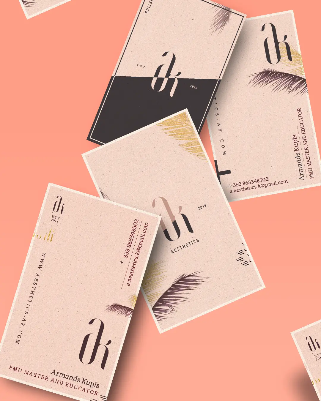
Why Aesthetics Matter
In a world saturated with advertisements and marketing materials, it is crucial to make every interaction count. Your business card is often the first impression a potential client or customer has of your brand. A well-designed, aesthetically pleasing card not only captures attention but also conveys professionalism and attention to detail. By investing time and effort into the aesthetics of your business card, you are demonstrating your commitment to excellence and leaving a lasting impression that sets you apart from the competition.
Choosing the Right Color Palette
Color plays a significant role in aesthetics, and it can evoke specific emotions and associations. When designing your business card, it is essential to choose a color palette that aligns with your brand and conveys the desired message. Consider the psychology of colors and their impact on human emotions. For example, blue is often associated with trust and professionalism, while yellow signifies optimism and creativity. Selecting a color palette that resonates with your brand values and target audience can help create a visually appealing card that leaves a positive impression.
Typography Matters
The choice of typography can greatly influence the overall aesthetics of your business card. Fonts have personalities, and selecting the right one can enhance the visual appeal and reflect your brand identity. An elegant and sophisticated font might be suitable for a luxury brand, while a playful and bold font could work well for a creative agency. When choosing typography, ensure that it is readable and legible, even at small sizes. Avoid using too many different fonts, as it can make your card appear cluttered and unprofessional.
The Power of Negative Space
Sometimes, less is more. The strategic use of negative space can elevate the aesthetics of your business card. Negative space, also known as white space, refers to the empty areas between design elements. Leaving enough space around key elements on your card enhances readability and allows the design to breathe. It also creates a sense of balance and elegance. When designing your business card, consider the placement of text and graphics, leaving enough negative space to create a visually appealing composition.
Incorporating your Logo
Your logo is the visual representation of your brand, and including it on your business card is crucial for brand recognition and consistency. Make sure that your logo is prominently displayed and can be easily identified. It should be appropriately sized, ensuring that it doesn’t overpower the other elements while still being visible. The placement of your logo can vary depending on your design preferences and the overall layout of the card. Experiment with different placements to find what works best for your brand.
Texture and Finishing Options
Adding texture and choosing the right finishing options can take the aesthetics of your business card to the next level. Consider using specialized printing techniques such as embossing, foil stamping, or letterpress to create a tactile experience for the recipient. These techniques not only enhance the visual appeal but also convey a sense of luxury and quality. Additionally, selecting high-quality paper or opting for unique finishes like matte or glossy can make your card stand out and reflect the aesthetics of your brand.
The Importance of Cohesion
Aesthetics business cards should seamlessly blend with your overall branding strategy. It is essential to maintain consistency in terms of colors, typography, and overall design aesthetic. Your business card should complement your website, logo, and other marketing materials, creating a cohesive and recognizable brand identity. Consistency in design helps build brand recognition and reinforces the image you want to portray. By maintaining a consistent aesthetic across all platforms, you establish credibility and professionalism, making it easier for clients and customers to remember and identify your brand.
Conclusion
In conclusion, aesthetics business cards are more than just pieces of paper with contact information. They are powerful marketing tools that can make a significant impact on your brand’s success. By carefully considering color, typography, negative space, logo placement, texture, and finishing options, you can create a visually appealing card that reflects the aesthetics of your brand. Remember, aesthetics should be cohesive with your overall branding strategy to create a lasting impression and build brand recognition. So, let your business cards become the key to making a remarkable first impression and set yourself apart from the competition.
Ava Taylor’s passion for branding and marketing shines through in her dynamic writing. She brings a unique perspective with her background in event planning, infusing creativity into her content. When she’s not writing, Ava enjoys organizing community events and gatherings.