
Have you ever received a business card with such small font that you struggled to read the contact information? Or on the contrary, have you encountered a business card with such large font that it looked unprofessional? The font size you choose for your business card plays a crucial role in determining how effectively it communicates your information and represents your brand. In this article, we will explore the importance of font size for business cards and provide you with some guidelines to help you select the perfect typography for your cards.
Why is Font Size Important for Business Cards?
The font size on your business card directly affects its readability. If the font is too small, it can be challenging for recipients to read the contact details, which defeats the purpose of a business card. On the other hand, if the font is too large, it may give the impression of unprofessionalism or lack of attention to detail.
Furthermore, your font size needs to strike a balance between providing enough information and maintaining a clean and organized design. A cluttered business card with tiny text can be overwhelming and off-putting to potential clients or collaborators.
Factors to Consider When Choosing Font Size

1. Target Audience
Consider the demographics of your target audience when determining the font size for your business cards. Age can have a significant impact on visual acuity, so understanding the general age group of your recipients is essential. If you are primarily targeting older individuals, it may be wise to opt for a slightly larger font size to ensure readability. Conversely, if your audience is predominantly young and technologically savvy, a slightly smaller font size might be acceptable.
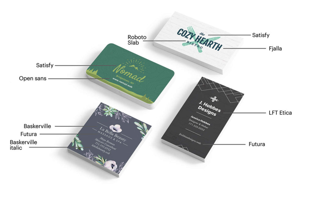
2. Typography Style
Different fonts have different sizes for the same point value. For instance, a 10-point font in one typeface may appear larger than a 10-point font in another. Consider the style and characteristics of the typeface you choose and test different font sizes within that specific typeface to see which one works best for your business card.
3. Purpose of the Business Card
Think about the primary purpose of your business card. If it is predominantly a visual representation of your brand with limited contact information, you may have more flexibility on font size. However, if your card aims to provide comprehensive contact details, it is crucial to ensure legibility without overcrowding the design.
4. Contact Information Hierarchy
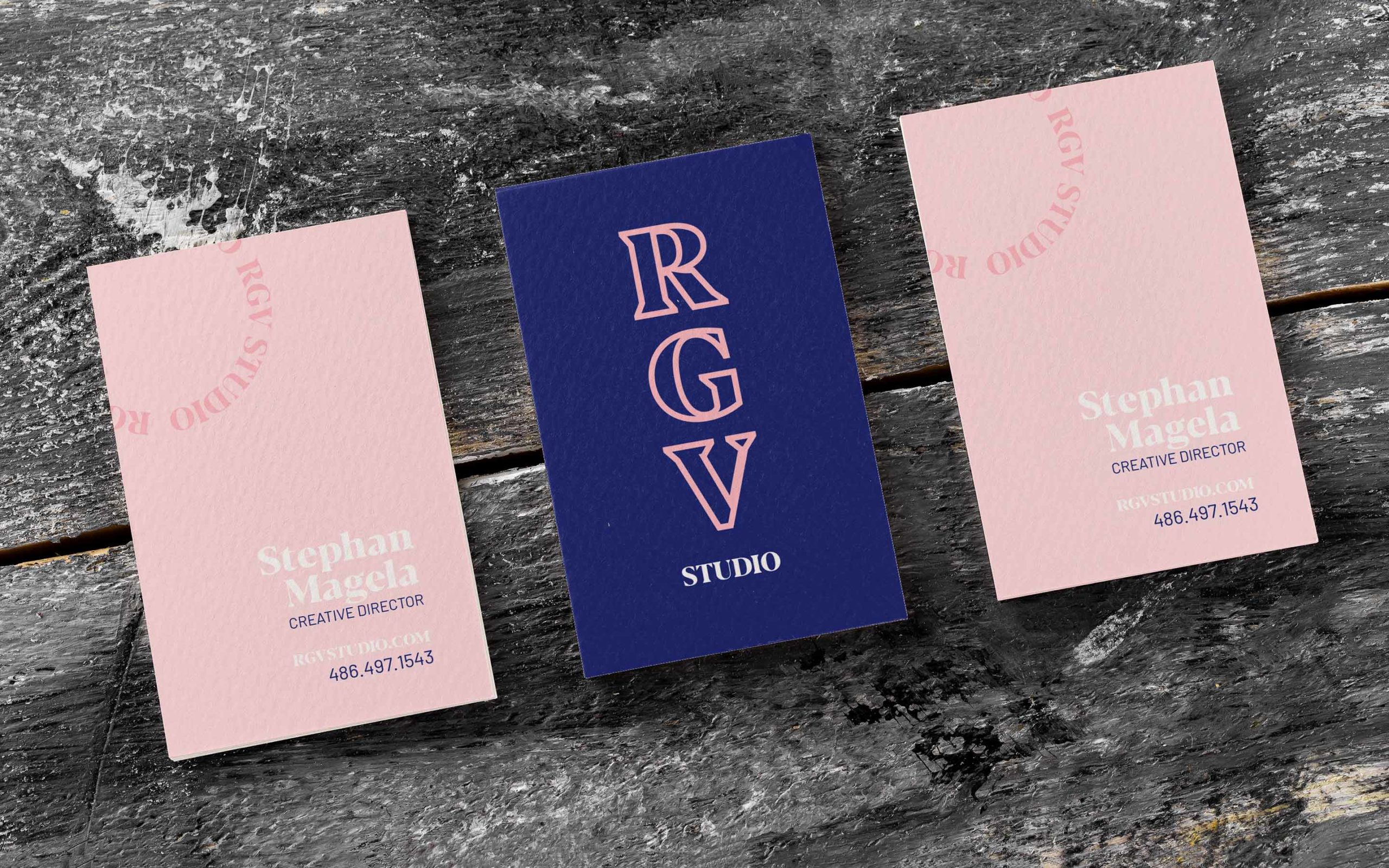
Determining the hierarchy of your contact information can guide you in selecting appropriate font sizes. Consider which elements need to stand out the most, such as your name or phone number. These important details should be slightly larger than secondary information like your job title or email address.
Recommendations for Font Sizes on Business Cards
While there is no one-size-fits-all answer when it comes to font size for business cards, we can provide some general recommendations based on industry standards and best practices.
1. For the Main Contact Information
Your name, phone number, and email address are typically the most important pieces of contact information on a business card. Use a font size between 10 and 12 points for these details to ensure readability without dominating the design. You want these elements to be easily noticeable at a quick glance.
2. For Secondary Information
Secondary details, such as your job title, website, and social media handles, can be slightly smaller than the main contact information. Aim for a font size between 8 and 10 points to maintain a neat and organized layout. These details should still be legible, but they do not need to be as prominent as your name and primary contact information.
3. For Additional Information or Design Elements
If you choose to include additional information, such as a slogan or a short description of your business, consider using a smaller font size. Ideally, keep it between 6 and 8 points to prevent overcrowding and maintain a clean design. Also, be cautious not to compromise legibility.
Importance of Visual Balance
Beyond font size, achieving a visually balanced design is crucial for effective communication on business cards. Use appropriate spacing and alignment to ensure that your chosen font size complements the overall layout. Avoid overcrowding the card with too much text or too many design elements. Embrace white space to enhance readability and give your business card an elegant and professional appearance.
Conclusion
The font size you choose for your business cards plays a significant role in their overall effectiveness. It impacts both the legibility of your contact information and the overall impression your card conveys. By considering your target audience, typography style, purpose of the card, and contact information hierarchy, you can select an appropriate font size that ensures your business card effectively communicates your brand and contact details. Remember, striking a balance between readability and visual appeal is essential for creating an impactful business card that leaves a lasting impression on your recipients’ minds.
William’s writing reflects a deep passion for graphic design and marketing. With a background in the visual arts, he adds a unique perspective to his content. In his spare time, William enjoys visiting art galleries and seeking out the latest design trends.